We are currently experiencing payment processing issues. Our team is working to resolve the problem as quickly as possible. Thank you for your patience
Naoya's GFX Corner
1

I'm new to this forum thing and I thought to myself, a good way to introduce myself to the community is to just dive in there. So here i am.
These are just a few of the graphics I've done in the past month or so, also I'm fairly new in the area, so don't be too harsh >.<
If you have any questions about any of the graphics I've done, please, don't hesitate to ask.
Lastly credits to all the stocks, renders, etc owners, all I did was the editing peace.
(> v <)♪♪♪
These are just a few of the graphics I've done in the past month or so, also I'm fairly new in the area, so don't be too harsh >.<
Spoiler:

Spoiler:

If you have any questions about any of the graphics I've done, please, don't hesitate to ask.
Lastly credits to all the stocks, renders, etc owners, all I did was the editing peace.
(> v <)♪♪♪
0
Heey and welcome to the forum!
I think it is incredible to meet other Graphic makers especially on a site like this!
your edits are pretty nice thinking of the fact that you are new with this! I wish you good luck and as a graphic maker myself, if you need any help feel free to write me up!
Looking forward to see your future works
0
xhimitsu wrote...
Heey and welcome to the forum! I think it is incredible to meet other Graphic makers especially on a site like this!
your edits are pretty nice thinking of the fact that you are new with this! I wish you good luck and as a graphic maker myself, if you need any help feel free to write me up!
Looking forward to see your future works
Thanks a lot! And I know what you mean xD
Also I think I'll take you up on your offer, I actually am really bad at making png's blend in with the rest of the work, so my works usually end up pretty bland ^^" Any tips on that? :3
0
Hmm I always wonder what to do with the pngs too..
I usually put a border or a glow on the png. It will really help If you ask me, it will blend or 'fade' nicer into the background. Or make a 'shadow' for the png so give it some perspective.
Depending on the background I sometimes 'erase' some part to make a fading effect or go down in fill or opacity! Play with adjustments to make sure the PNG doesn't sit plain on top of the layers of textures, brushes etc. Make the colours and lighting on the PNG fit in~ If your graphic is dark try to make your png's lighning go down a bit too or make it WAY too shiny to make contrast.
Stocks & text are your friend too. Things like flowers, Gears, clocks and such can help you cover up parts of the Png so it isn't 'just' the top layer~
I hope it will help you a bit, if you need something more specific like an example or something feel free to ask~ ^^)/
0
xhimitsu wrote...
Hmm I always wonder what to do with the pngs too.. I usually put a border or a glow on the png. It will really help If you ask me, it will blend or 'fade' nicer into the background. Or make a 'shadow' for the png so give it some perspective.
Depending on the background I sometimes 'erase' some part to make a fading effect or go down in fill or opacity! Play with adjustments to make sure the PNG doesn't sit plain on top of the layers of textures, brushes etc. Make the colours and lighting on the PNG fit in~ If your graphic is dark try to make your png's lighning go down a bit too or make it WAY too shiny to make contrast.
Stocks & text are your friend too. Things like flowers, Gears, clocks and such can help you cover up parts of the Png so it isn't 'just' the top layer~
I hope it will help you a bit, if you need something more specific like an example or something feel free to ask~ ^^)/
Thank you for your advice! I took it into account and I tried to make another banner and I think what you said helped me make it better! (:
0
Update:
I am quite satisfied with this work, mainly because I made it on my favourite female anime character!
Hope you guys like it too :)
I am quite satisfied with this work, mainly because I made it on my favourite female anime character!
Hope you guys like it too :)
Spoiler:

0
Another update:
This time I played with animations and hence I made my very first animated signature/banner.
Hope you guys like it!
This time I played with animations and hence I made my very first animated signature/banner.
Hope you guys like it!
Spoiler:
0
I think your Yuno banner looks nice, but it is quite tall for a banner imo. I like the blood and red since Yuno is a bit crazy. our cute yandere girl. I don't quite get the reasoning behind you adding the broken glass texture over her head though? Especially since the texture doesn't fill out the entire signature. Mind to share your thoughts? Also the text is of good choice, would recommend you to had chosen another colour though to make some contrast to the rest of your signature. and lastly maybe have moved Yuno down to the bottom of the signature so she isn't floating? Just some of my thought! feel free to ignore and comment on them! I didn't mean to put you down but just give you some of my thought on what I would have done or preferred. It is you your signature so of course you are welcome to do whatever with it you want.
I think your animated signature works better with colour and contrast but still quite tall for my taste. Moving a bit too fast can be quite distracting but else good work! ^^)/
I think your animated signature works better with colour and contrast but still quite tall for my taste. Moving a bit too fast can be quite distracting but else good work! ^^)/
0
xhimitsu wrote...
I think your Yuno banner looks nice, but it is quite tall for a banner imo. I like the blood and red since Yuno is a bit crazy. our cute yandere girl. I don't quite get the reasoning behind you adding the broken glass texture over her head though? Especially since the texture doesn't fill out the entire signature. Mind to share your thoughts? Also the text is of good choice, would recommend you to had chosen another colour though to make some contrast to the rest of your signature. and lastly maybe have moved Yuno down to the bottom of the signature so she isn't floating? Just some of my thought! feel free to ignore and comment on them! I didn't mean to put you down but just give you some of my thought on what I would have done or preferred. It is you your signature so of course you are welcome to do whatever with it you want. I think your animated signature works better with colour and contrast but still quite tall for my taste. Moving a bit too fast can be quite distracting but else good work! ^^)/
First and foremost, thank you for the compliments! It's greatly appreciated ^^
Gasai Banner: I made a mistake while editing and it was supposed to fit the whole image. I ended up trying out something on the images and it opened in a new window, I ended up closing the original one by accident...If this even made any sense...
Also about the size, idk why but I just like it bigger for some reason, large banners are what I like but I'll try to tone it down some xD
Animated Siggy: Thanks! I actually got the urge to do it because I saw your signature xD Anyway I agree that it moved too fast, and if I ever make another animated signature I will try to put more frames in.
0
Update:
This one is just a random tag I did when I tried rendering the image. Then it just turned out quite.messy imo. Still I hope you guys like it!
This one is just a random tag I did when I tried rendering the image. Then it just turned out quite.messy imo. Still I hope you guys like it!
Spoiler:

0
Naoya. wrote...
xhimitsu wrote...
I think your Yuno banner looks nice, but it is quite tall for a banner imo. I like the blood and red since Yuno is a bit crazy. our cute yandere girl. I don't quite get the reasoning behind you adding the broken glass texture over her head though? Especially since the texture doesn't fill out the entire signature. Mind to share your thoughts? Also the text is of good choice, would recommend you to had chosen another colour though to make some contrast to the rest of your signature. and lastly maybe have moved Yuno down to the bottom of the signature so she isn't floating? Just some of my thought! feel free to ignore and comment on them! I didn't mean to put you down but just give you some of my thought on what I would have done or preferred. It is you your signature so of course you are welcome to do whatever with it you want. I think your animated signature works better with colour and contrast but still quite tall for my taste. Moving a bit too fast can be quite distracting but else good work! ^^)/
First and foremost, thank you for the compliments! It's greatly appreciated ^^
Gasai Banner: I made a mistake while editing and it was supposed to fit the whole image. I ended up trying out something on the images and it opened in a new window, I ended up closing the original one by accident...If this even made any sense...
Also about the size, idk why but I just like it bigger for some reason, large banners are what I like but I'll try to tone it down some xD
Animated Siggy: Thanks! I actually got the urge to do it because I saw your signature xD Anyway I agree that it moved too fast, and if I ever make another animated signature I will try to put more frames in.
I think I got it, about the closed window, but that doesn't quite explain why you choose the broken glass? If you had any reasoning for choosing it?
Nah you don't have to tone it down. I mean you sould make signatures the way you like them and not how others like them. (well if they are for yourself that is). I used to liked bigger signatures too since there is more space to fill in things, though with a bigger signature the more space it take up on posts too, and since you don't want to bother other people by having them to school 1000 pages you should probably consider making them smaller if you use them on boards. Also many forums have signature height limit. But for fun you might even make it 500px height if you wish to do so~ ^^)/
I see, Thank you! I feel honoured that I was able to inspire you or make you want to try it out! You don't necessarily need to make more frames but just make the delay longer~ ^^)/ looking forward to see your next animated signature
About the newest signature you just made, it is probably the one I like the best? I think the borders are super cool and I like the glow around the characters. I would probably had put on a glow on the shadow too or just a border since the edges is super sharp. Text and colours look fine! ^^ You keep improving!
0
xhimitsu wrote...
I think I got it, about the closed window, but that doesn't quite explain why you choose the broken glass? If you had any reasoning for choosing it?
Nah you don't have to tone it down. I mean you sould make signatures the way you like them and not how others like them. (well if they are for yourself that is). I used to liked bigger signatures too since there is more space to fill in things, though with a bigger signature the more space it take up on posts too, and since you don't want to bother other people by having them to school 1000 pages you should probably consider making them smaller if you use them on boards. Also many forums have signature height limit. But for fun you might even make it 500px height if you wish to do so~ ^^)/
I see, Thank you! I feel honoured that I was able to inspire you or make you want to try it out! You don't necessarily need to make more frames but just make the delay longer~ ^^)/ looking forward to see your next animated signature
About the newest signature you just made, it is probably the one I like the best? I think the borders are super cool and I like the glow around the characters. I would probably had put on a glow on the shadow too or just a border since the edges is super sharp. Text and colours look fine! ^^ You keep improving!
I chose the broken glass because I tried to make it so it looked like she broke a window xD I put a transparent layer in from of every other layer and kind of tinted it, it obviously didn't work that well though haha!
Thanks, also I know what you mean about the sizing, I mean I don't really use it on any forums, I just post it on my deviantart and here, and yeah I used to make standard signature sizes, I think it was 500x200 but idk I feel like bigger signatures look better in my eyes :P
About that, idk about you but I use gimp, and I have no clue on how to make the frames more delayed ._. If I may bother you, how are you able to do that?
Thanks! I'm pretty proud that one myself :P Thank you, I found a way to make softglow work better xD Also I did have a glow on the shadow, but it probably didn't turn out well again > < And I will try to experiment on borders, but I can't guarantee it'll work out xD
And as always, thanks for the compliments! It is greatly appreciated!
0
Naoya. wrote...
About that, idk about you but I use gimp, and I have no clue on how to make the frames more delayed ._. If I may bother you, how are you able to do that?
I use photoshop for everything so unless you have photoshop it might be hard for me to explain it to you? If you have I can try to explain and guide you through it
And as always, thanks for the compliments! It is greatly appreciated!
You are very welcome. I love seeing other people's GFX.

This is very very nice! I think the textures blend in very nicely with the text and the character. Also i like the flowers and the choice of font! ^^)/ Record beat. New favourite!
0
xhimitsu wrote...
I use photoshop for everything so unless you have photoshop it might be hard for me to explain it to you? If you have I can try to explain and guide you through it
And as always, thanks for the compliments! It is greatly appreciated!
You are very welcome. I love seeing other people's GFX.
This is very very nice! I think the textures blend in very nicely with the text and the character. Also i like the flowers and the choice of font! ^^)/ Record beat. New favourite!
Oh, well I don't really have PS, though I want to, so sorry. Thanks for the offer though!
Thanks again! I'm glad you thought this one was good, I tried really hard on this tag, and I really appreciate all the comments on this!
Also thanks for always trying to help me out, thanks to that I've improved quite a bit, at least I'd like to think :) So if there's anything I can do to try and help you back, please, don't hesitate to ask ^^


0
Tegumi wrote...
You're making good improvements. Keep it up!Thank you soo soo much! I greatly appreciate the comment ^^
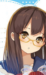
Update:
This time it's Mashiro from Bakuman
Spoiler: