We are currently experiencing payment processing issues. Our team is working to resolve the problem as quickly as possible. Thank you for your patience
Need some constructive critiscism.
0
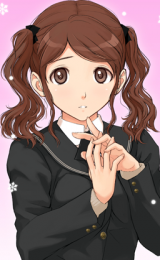
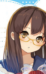
Hey guys, I'm not really confident on my art (even though my friends say it's great) so I'll just drop my deviantart over here and hope for some critiscim from you guys (Construtctive pl0x) :B
Deviantart
Deviantart
0

:O
I cant find anything to criticize sorry! Looks amazing and perfect to me! Keep going, because you are great at it! :)
I cant find anything to criticize sorry! Looks amazing and perfect to me! Keep going, because you are great at it! :)
0
I looked all of it up and stared for long times. It was great but something was obviously something for it be deemed as epic. Perhaps its the coloring? Maybe the background? Maybe because the characters seem like they will never move?
0
Wow thanks guys, I'll start drawing even more then to improve as much as I can :D, I appreciate it n_n
0
Your art is nice, but all you are really doing is copying other people's art. Sure, you do get a lot of practice like that, but try drawing your own characters, or some fanart in a pose that you designed instead. Cause right now, all I see is a varying style, and I don't get a sense of your own style.
0
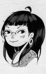
Misaki_Chi
Fakku Nurse
I'm not a seasoned critique so take my critiques with a grain of salt!
The areas that need improvement are in positioning. The one image you posted titled Tsuna (personal favorite of mine) is a good example. The lining of his chin to his face and down would overlap his neck (basically the chin would be crushed into his neck). His face should've been drawn wider to create proportion for his eyes nose and mouth.
Another work that shows this error is the Kingdom Hearts one. The way you drew Axel's face makes it look like he only has half a face. the lining under the eyes is a bit thick as well causing the appearence of bags under their eyes. If you also look at Xion's chin, the line is wider then it should which makes her look more masculine
The last critique is the movement of the work. The colors and your shading move very smoothly, but the piece as a whole feels stiff and incomplete. You are able to create such detail (such as with Tsuna's hand and hair), but the rest looks plain and unfinished in comparison. Treat your work as you would treat your car or food preparation you need all the parts to make something truly wonderful rather then just 'okay'.
You have good potentional and I hope to continue seeing more from you. I wish you much success in your future creations (^^)
0
You have a good hand, but as far as i could tell, you are afraid to use more striking colors (Yes i know "better gray than garish" but still :D)
And your use of shadow could get more pronounced, so that things would pop up or fade into back.
Btw, are you drawing only from references or do you use your imagination (and knowledge) alone too? Im just curious, because it looks like you have only ref drawings uploaded. I could be wrong though :D
Just keep it up! And you'll get even better. :D
0
I'm not super skilled in art and anatomy is not my best friend.
but here are something I noticed:
Overall it looks nice but there are some places where I think the pupil in the eye is placed off or where the anatomy doesn't work as well as it should. For example in Akazawa Isumi from Another the neck is very thin it makes me wonder if her head is too heavy and will tip over and I feel the right side of the face shape is a bit off. Also some of the one piece drawings I feel like the face can't fit inside the head. It feels rushed and crushed. I like the colouring and shading and don't really mind the unsaturated colours. But other than Tsuna from KHR I feel that some of the others are missing a third shade and medium highlight which isn't white. Our pencil B&W is shaded nice though. Sometimes you might have to make it clearer where the light source is coming from.
Sorry if it all sounds pretty general. Maybe I'm just OCD when it comes to things I have seen before about 'non' original fanart/art. I know it is hard to draw what you see to make it look exactly the same and that alone takes a lot of time, practice and hard work. But since most of it is 'copying' (not meant in a bad way) It is hard to give you criticism since that would be like criticizing the mangaka itself. Also because you don't have your own style in it. You just draw, shade and colour where it is shown in the original picture. Of course it might make you observe things you wouldn't have thought about before. But honestly I feel like I have to compare different mangaka's art styles to find "mistakes" in your art which feels off because each artist has its own style.
But good work and I hope you will keep sharing more of your art! I would love to see more KHR especially since Akira Amano is one of my favourite mangakas~ (I like your taste in series!) Keep practicing and hopefully when you feel confident enough try to draw more original or original fanart. That is indeed the best practice to improve drawing! It might feel off but you can always start 'borrowing' poses and outfits to get a hang of it.
Also good tip for yourself (hard to do with traditional) but try mirroring the picture (look at your drawing in a mirror or hold it up against a window) to see if everything which should look symmetrical is. By mirroring it, it will feel like you get to view a completely new angle of your drawing.
//sorry long post!.. didn't mean to sound like an expert or a bitch..