Argentine Graphic Showcase
0
Decided to make a few every now and then.Will make at least 1 per week
I may upload resources like renders for others to use if requested.
Lastly I thank anyone who comes visit me here ^^
This week:Sakuya Izayoi
This one is more of an experimentation
I may upload resources like renders for others to use if requested.
Lastly I thank anyone who comes visit me here ^^
This week:Sakuya Izayoi
Spoiler:
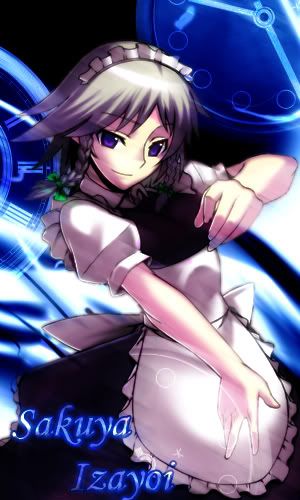
This one is more of an experimentation
Spoiler:

0
Tegumi
"im always cute"

Those aren't really sigs, they're much too tall.
I like the first one. The luminescent blue look is quite becoming. I don't quite like the second one.
I like the first one. The luminescent blue look is quite becoming. I don't quite like the second one.
0
lol well i tend to go against the normal sig template
I will go with the standard template with the next one
Thank you
I will go with the standard template with the next one
Thank you
0

I like the first one a lot, but the 2nd one isn't very nice looking. Also that is the first time that I seen a sig template that huge. o.o
0
Hmmm , there are vertical sigs , but yours are too wide.
Text doesn't blend.
Pattern Overlay isn't really good sometimes.
Text doesn't blend.
Pattern Overlay isn't really good sometimes.
0
@lelouch20:Thank you very much.Please give me more renders in future XD
@RoopLoop:Pattern overlay?
Any way this week I did one on Saber:
In any case I do accept requests,if you have any ^^
@RoopLoop:Pattern overlay?
Any way this week I did one on Saber:
Spoiler:

In any case I do accept requests,if you have any ^^
0
Hentanize
rebaS

Argentine wrote...
Any way this week I did one on Saber:
Spoiler:
It's quite nice but i don't like the text font... Or i just don't like how the text doesn't blend in with the rest.


0
Update:
Err this seems like a double post so forgive me
For takufox
For my master
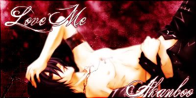
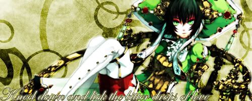
This one the text is abit hard to read,but it says "Bow down and lick the bitter drops of love"
Err this seems like a double post so forgive me
For takufox
Spoiler:

For my master
Spoiler:
This one the text is abit hard to read,but it says "Bow down and lick the bitter drops of love"
Spoiler:
0

For the sake of bumping , that's okay tho ... as long as it still in topic and contribute ...
For the first one, i have seen it already .. and personally , i think the font and color there are too ... eye catchy .. maybe reducing the opacity or change color will help
but i guess the girl and bg ... synch quite well .. that's great
second,
the only problem is .. bad choice of font and the words are too long .... just in my opinion
third,
As same as the second one, font and word length problem