We are currently experiencing payment processing issues. Our team is working to resolve the problem as quickly as possible. Thank you for your patience
Dudels
0
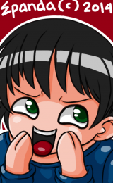
Here's something random ehehe. I guess you know what K-On is ...
------------------------
Not mine
Real Life Ritsu ( Drummer )
http://www.youtube.com/watch?v=70fMQ_V2Y7Q
Lolx K-On hehe. ( Rated +18 for offensive finger by Yui for about 15 seconds ).
http://www.youtube.com/watch?v=Y2pTweqylZg...feature=related
------------------------
And Another Doodle hehe ...
------------------------
Not mine
Real Life Ritsu ( Drummer )
http://www.youtube.com/watch?v=70fMQ_V2Y7Q
Lolx K-On hehe. ( Rated +18 for offensive finger by Yui for about 15 seconds ).
http://www.youtube.com/watch?v=Y2pTweqylZg...feature=related
------------------------
And Another Doodle hehe ...
Spoiler:
0
Juggle wrote...
Here's something random ehehe. I guess you know what K-On is ...------------------------
Not mine
Real Life Ritsu ( Drummer )
http://www.youtube.com/watch?v=70fMQ_V2Y7Q
Lolx K-On hehe. ( Rated +18 for offensive finger by Yui for about 15 seconds ).
http://www.youtube.com/watch?v=Y2pTweqylZg...feature=related
------------------------
And Another Doodle hehe ...

Very nice work Juggle's!
I love B/W pieces!
0
Juggle wrote...
Hmm, my pics are so big ... what other picture upload sites can you guys recommend? DA seems out ... can't post pics with it ....
SadPanda is Fakku's favourite image hosting site, hosted by Gelbooru. The kind souls there also made a batch uploader to upload multiple files straight from Windows Explorer.
Cool work, by the way. I'll be keeping an eye on this thread. ;)
0
doswillrule wrote...
SadPanda is Fakku's favourite image hosting site, hosted by Gelbooru. The kind souls there also made a batch uploader to upload multiple files straight from Windows Explorer.Cool work, by the way. I'll be keeping an eye on this thread. ;)
Thnx XD, I'll be trying this one and maybe edit all of my entries XD ...
Edit: Sadpanda died .... using postimage image host for now :3


0
That first one is in an awkward position (elbow).
Same thing goes for the left arm on Luffy.
I do like the frills on the first one.
Same thing goes for the left arm on Luffy.
I do like the frills on the first one.

0
Satan wrote...
That first one is in an awkward position (elbow).Same thing goes for the left arm on Luffy.
I do like the frills on the first one.
I'm practicing poses at the moment ... can't really grasp it perfectly but I'm getting there XD
KanuUnchou wrote...
lines r too thick...I'm going for the japanese style inking though I know my style doesn't have any line width variations, also using thick lines on lineart feels more easy and comfortable ( maybe its just me )
1
Juggle wrote...
Update: Picked up my pen again .... Doodle time ....Spoiler:

These doodles are lively and have some good personality in the subject matters. But i somewhat agree with the thick line comment. Line art is fine, but thick lines usually represent a lack of confidence in your strokes. When an artist is uncertain of an action, whether subconscious or consciously, it shows in the product. To counter a shakey unconfident stroke usually we naturally press down harder on the drawing tool. I get something similar if i take a break for to long and my coordination goes down.
Also the reason Manga looks the way it looks is because of time constraints. There's usually a deadline for most Manga. So it's more effective to just lay down lines and then put down tone. The lines are left intact because in order to phase out the lines the Artist would have to add more tone and value to the art. A black line does two things, it represents the end of the surface area. If a character or object is completely surrounded by a black line, it'll appear flat. If you look at most Art books released by Mangaka, they chose to do full renders as opposed to the usual ink toning they do for manga.
This doesn't mean a black line doesn't have a place in art, but it shouldn't completely encase the subject. Darken lines in the places you want to create contrast in, this will naturally draw attention to that area. A good place to put them is usually around the face, that's where you want people to look. Thick black lines are usually to jarring for the eyes. I usually hold my pencil around the midsection of the pencil itself. The closer you get to the nib the easier it'll be for you to push down harder.
NOTE: I'm mostly referring to finished pieces. If you're just brainstorming, doodling to loosen up, doing gestures or doing studies then it's all good.
Lastly i'll put this piece of art up by Noizi Ito, it has fairly good line balance in it. I tried to pick out an artist with a somewhat similar style to yours.

0
IvIajoi2n wrote...
These doodles are lively and have some good personality in the subject matters. But i somewhat agree with the thick line comment. Line art is fine, but thick lines usually represent a lack of confidence in your strokes. When an artist is uncertain of an action, whether subconscious or consciously, it shows in the product. To counter a shakey unconfident stroke usually we naturally press down harder on the drawing tool. I get something similar if i take a break for to long and my coordination goes down.
Also the reason Manga looks the way it looks is because of time constraints. There's usually a deadline for most Manga. So it's more effective to just lay down lines and then put down tone. The lines are left intact because in order to phase out the lines the Artist would have to add more tone and value to the art. A black line does two things, it represents the end of the surface area. If a character or object is completely surrounded by a black line, it'll appear flat. If you look at most Art books released by Mangaka, they chose to do full renders as opposed to the usual ink toning they do for manga.
This doesn't mean a black line doesn't have a place in art, but it shouldn't completely encase the subject. Darken lines in the places you want to create contrast in, this will naturally draw attention to that area. A good place to put them is usually around the face, that's where you want people to look. Thick black lines are usually to jarring for the eyes. I usually hold my pencil around the midsection of the pencil itself. The closer you get to the nib the easier it'll be for you to push down harder.
NOTE: I'm mostly referring to finished pieces. If you're just brainstorming, doodling to loosen up, doing gestures or doing studies then it's all good.
Thanks for the comment and example ...
I'm currently trying to imitate a style ( Ken Akamatsu for Love Hina / Negima ) ....

I have a hard time adjusting from thick to thin lines and specially the cross hatching >.< shadow ..... that example you posted seem very cutesy ( I have a hard time drawing them ) and the artist used very thin lines, mostly visible with color ( noob colorist T.T )
Whenever i try to use thin lines it makes me frown and think its ugly and incomplete ( I dunno why ) .... maybe I need to adjust my mentality first lol ..... Also, I just started reading a how to draw book ( forgot the title but its not a Manga tutorial but a western one about anatomy and muscles ) the proportion for REAL human anatomy is very different for manga style but I try to apply where the muscles are most of the time ....
So for now I just doodle away to imitate the Artist i like and at the same time learn anatomy ( well I guess I can slowly practice on lineart and adjust my line widths along the way )
0
Spoiler:
It's because of how little tone is on the drawing. So far the darkest places on most of these pieces are the lines. Start increasing your value range slowly to increase your confidence in value. Work with darker darks and lighter lights. The more variation in value you can put down on a drawing, the better it's going to look.
Also Real Anatomy and Anime anatomy are not very different from one another. They seem very stylized, because the original artist knew what parts of the body he could alter without making it look odd. Even Ken Amatsu keeps his figures fairly close to the 8 Head figure. The middle of the breasts is generally about 2 heads down. The navel about 3 head down, the groin about 4 heads down. The legs will be about 4 heads in length, with the knee roughly being at the 6 head mark.
The main difference between Anime and Real anatomy is the amount of detail being put on to the muscles. Otherwise the general structure is close if not identical. Obviously with some exceptions like Panty & Stocking.
There's two types of Stylization that can occur, Informed Styles and Forced Styles. The latter usually occurs when someone is uncertain of how something is structured, you're brain tries the best it can to create what it thinks might be correct. Informed Styles are when the artist makes a conscious decision to change an element of his design. Most artists start drawing fairly realistically at least with studies. They know how the foundation function, then they change things based on what their design goals are.
Lastly, i will say the most recent image you did, shows some very strong anatomical improvements from when your older pieces. it can be pushed forward but the improvement is still very noticable.
Below i provided a rough image from Love Hina one of Ken Akamatsu's anime. I outlined the general real proportion it uses. Also just a few locations of muscle groups & Bones that were noticable on the surface.

0
IvIajoi2n wrote...
It's because of how little tone is on the drawing. So far the darkest places on most of these pieces are the lines. Start increasing your value range slowly to increase your confidence in value. Work with darker darks and lighter lights. The more variation in value you can put down on a drawing, the better it's going to look.
Also Real Anatomy and Anime anatomy are not very different from one another. They seem very stylized, because the original artist knew what parts of the body he could alter without making it look odd. Even Ken Amatsu keeps his figures fairly close to the 8 Head figure. The middle of the breasts is generally about 2 heads down. The navel about 3 head down, the groin about 4 heads down. The legs will be about 4 heads in length, with the knee roughly being at the 6 head mark.
The main difference between Anime and Real anatomy is the amount of detail being put on to the muscles. Otherwise the general structure is close if not identical. Obviously with some exceptions like Panty & Stocking.
There's two types of Stylization that can occur, Informed Styles and Forced Styles. The latter usually occurs when someone is uncertain of how something is structured, you're brain tries the best it can to create what it thinks might be correct. Informed Styles are when the artist makes a conscious decision to change an element of his design. Most artists start drawing fairly realistically at least with studies. They know how the foundation function, then they change things based on what their design goals are.
Lastly, i will say the most recent image you did, shows some very strong anatomical improvements from when your older pieces. it can be pushed forward but the improvement is still very noticable.
Below i provided a rough image from Love Hina one of Ken Akamatsu's anime. I outlined the general real proportion it uses. Also just a few locations of muscle groups & Bones that were noticable on the surface.
I tried thinner lines and my level of coloring at the moment lol XD .... 2 layers at most ..... HOW DO YOU COLORS NIPPLES????? I need a color palette ....

0
Spoiler:
Big improvement, but stop thinking in lines and start thinking in values. If there's a place you can eliminate a line then it's worth doing it (sometimes). For example you drew a line around the nipples. You didn't need to do that, there's already a boundary being created. The nipple is a different color from the skin so when those two colors meet they'll create a natural boundary so there isn't a need for a line. Out of curiosity what program are you using to color? also are you using a tablet or just a mouse??
I made this really quick sketch to represent what i'm talking about, since i couldn't find anything in my books that was less then 5 pages. Lines are there to create an outline for the drawing, once you start filling in values you can start phasing out lines. When two values meet then the boundary is already implied, so you don't need a line anymore. Line also plays a role in texturing but that's something you can worry about later.

0
IvIajoi2n wrote...
Big improvement, but stop thinking in lines and start thinking in values. If there's a place you can eliminate a line then it's worth doing it (sometimes). For example you drew a line around the nipples. You didn't need to do that, there's already a boundary being created. The nipple is a different color from the skin so when those two colors meet they'll create a natural boundary so there isn't a need for a line. Out of curiosity what program are you using to color? also are you using a tablet or just a mouse??
I made this really quick sketch to represent what i'm talking about, since i couldn't find anything in my books that was less then 5 pages. Lines are there to create an outline for the drawing, once you start filling in values you can start phasing out lines. When two values meet then the boundary is already implied, so you don't need a line anymore. Line also plays a role in texturing but that's something you can worry about later.
I'm using SAI Paint Tool for lineart and coloring and a Wacom Bamboo Fun Tablet XD .... I'll try to avoid drawing the round circle around them nips =)
0
supposedly horns but exaggerated a bit ... haven't actually done a good one yet XD
........
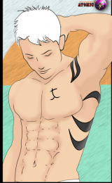
Adding New pics ... practicing muscles .... kinda hard to remember where and what connects to which ..... I think I'm improving a bit .... now the tough part is those hand >.< ..... specially the foreshortening ....
Edit: Image Host Error >.>
Saturdays is a good time to doodle a ton ....
........
Adding New pics ... practicing muscles .... kinda hard to remember where and what connects to which ..... I think I'm improving a bit .... now the tough part is those hand >.< ..... specially the foreshortening ....
Edit: Image Host Error >.>
Saturdays is a good time to doodle a ton ....