How to make a signature. Any advice welcome!
0

Soo I entered into this Waifu game (my first time!!) and I noticed how some of you veteran Fakkutiers have some awesome sigs! (Yes, even those having nothing to do with Waifus. They are all awesome.)
At any rate, I figured I ought to try and make a sig for myself. As in something better than a continuation of my avatar. ^^; Be warned: I have a lot of questions.
I have an image that I want to use and a copy of Photoshop, but I don't really know how to start it.What kind of dimensions should I ideally use? (I want to make some other signatures for some of the other forums I frequent)
I warned you earlier: Here be questions (and random thoughts).
Any recommendations on effects for the font? (I plan on having her name on the side)
I was thinking of extending the color on the right (her left) and putting her name there. Or the on the left in whitespace.
The big question: how do I resize the image to get all of Rikku in there and not make it huge?
Edit: just to make this clear my goal is to learn and *eventually* be somewhat self sufficient. And the two threads I found concerning sig requests were a few months old and I didn't wanna bug anyone constantly. I figure with this it's a "advise if you feel like it" sorta thing.
0
Tegumi
"im always cute"

Most of the threads on the 1st page are active and their owners are still taking requests.
If you are utilizing Photoshop, the typical method is to utilize brushes to create a background. You can find brushes a dime a dozen at DeviantArt, or via a simple Google search. The alternative (see: lazy) method is to utilize part of a larger image, like a wallpaper or design, to set as your background.
Typically you want your stock (focus of signature, this can be a character or object) to be cut from its original background; this makes it easier to blend the stock with your custom background. The idea is to make your stock look like it belongs with your background. In general, the better you do this, the better your signature will be.
Additional things you can do is add borders and text to your signature. Generally a simple 1px border (easily achieved with Inner Stroke) suffices for a border. Text, like the stock, should attempt to match the overall style of the signature.
You can easily find signature making tutorials on Google, I'd recommend that you start there.
[size=4]In before repeat answers that don't actually offer new or better advice.[/h]

0
Tegumi wrote...
Most of the threads on the 1st page are active and their owners are still taking requests.Heh, well this is why I shouldn't be up at 2:40 AM looking at Fakku: I miss the blatantly obvious and extremely useful stuff.
*Shrugs* I still got some good advice and more ideas. Also, while I never did bother doing a search on the matter; I generally find that these forums are surprisingly helpful in many ways besides hentai-related information. So thanks for the advice Tegumi. I'll probably beg someone more experienced for help with this and then do my best to learn on my own and eventually come up with some stuff.
1

First of all you should learn how to extract the image you want from the background,via several methods
- Polygon lasso tool
- Magic wand
- Pen Tool
Personally I prefer the pen tool as it lets me multi task and to ctrl Z(Undo) is alot easier.
That way you have a nice clean image to start off with.Then you build the background from there.How I use fonts is I type out the text,and try out different fonts to see if it fits. You can look at different fonts at dafont.com.
Editted
My attempt at your pic,which I advise to use other pics since its not very ideal
Spoiler:

0
Tegumi
"im always cute"
Argentine wrote...
EdittedMy attempt at your pic,which I advise to use other pics since its not very ideal
Spoiler:
You probably should have tried to make the background sketchy or pencil-esque. If you read my tl;dr above, I mentioned that the most important thing was blending. Yes, the stock is not ideal at all (hard to make a clean cut), but I feel like the skill of the signature maker is reflected more if they're able to make it work.
0

render/stock is like 80% of a signature tbh.
i probably spend more time finding the right render picture than actually making the sig.
i probably spend more time finding the right render picture than actually making the sig.
0

I just don't get how to do the layering. That, and my Adobe Photoshop 4 doesn't have the magic wand (I think) or the polygon lasso tool.
0
Zandorf wrote...
I just don't get how to do the layering. That, and my Adobe Photoshop 4 doesn't have the magic wand (I think) or the polygon lasso tool.Layers are a piece of cake, and if you have Photoshop CS4 you should have both wand and lasso, you just need to look at the bottom right of each tools spot and hold down the mouse instead of just clicking. (hitting the little black corner arrow thing helps too if I recall, been a few months since I used PS)
Thanks Argentine! That's more or less what I wanted to do with that image, I just can never get the idea onto paper. Also, I don't know how to use the pen tool... ^^;
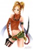
I got some new images that are less....risque than the majority of my Rikku collection and are better oriented to boot, but we'll see.
Spoiler:


Yeah, I have a bad habit of overextending myself. Which of these do you think would work best? I'll try fooling around with them when I have some free time in the future (which isn't looking too likely...)
0
darkling13 wrote...
Zandorf wrote...
I just don't get how to do the layering. That, and my Adobe Photoshop 4 doesn't have the magic wand (I think) or the polygon lasso tool.Layers are a piece of cake.
Care to explain? I'm a complete newbie with photoshop.
0
Argentine wrote...
First of all you should learn how to extract the image you want from the background,via several methods- Polygon lasso tool
- Magic wand
- Pen Tool
Personally I prefer the pen tool as it lets me multi task and to ctrl Z(Undo) is alot easier.
That way you have a nice clean image to start off with.Then you build the background from there.How I use fonts is I type out the text,and try out different fonts to see if it fits. You can look at different fonts at dafont.com.
Editted
My attempt at your pic,which I advise to use other pics since its not very ideal
Spoiler:
[size=1]I want to make love to you and your sig right now[/h]
0
sorry, had some issues last night posting. (I'm guessing due to the front page news. ): )
In the bottom right of the Photoshop window there should be an area that says layers. (That is the default location of the mini-window iirc). The best way to use layers is by having each effect on a different layer. Your first layer should be your background and (using a sig as an example) your subject and text should be on two different layers.
A nifty trick is to lock all layers you are not working with at the moment. There should be a lock icon, and if you click on the layer in the window beneath it (or right click and select lock layer) you will be able to see the different layers but not affect them with any modifications you are doing. That way you can touch up the background without accidentally smudging Rikku's face off or apply a texture to the bg and leave the rest of the image alone.
You can also hide certain layers, click under the little eye icon and that layer should vanish. Very useful if you want to make multiple versions of a layer to compare; or if you need to touch up an area and something is in the way. I'll try and edit this post (or make a new one) tonight with images to show you.
0
darkling13 wrote...
Zandorf wrote...
I just don't get how to do the layering. That, and my Adobe Photoshop 4 doesn't have the magic wand (I think) or the polygon lasso tool.Layers are a piece of cake, and if you have Photoshop CS4 you should have both wand and lasso, you just need to look at the bottom right of each tools spot and hold down the mouse instead of just clicking. (hitting the little black corner arrow thing helps too if I recall, been a few months since I used PS)
Thanks Argentine! That's more or less what I wanted to do with that image, I just can never get the idea onto paper. Also, I don't know how to use the pen tool... ^^;
I got some new images that are less....risque than the majority of my Rikku collection and are better oriented to boot, but we'll see.
Spoiler:
Yeah, I have a bad habit of overextending myself. Which of these do you think would work best? I'll try fooling around with them when I have some free time in the future (which isn't looking too likely...)
Ones that are in the centre, in which the characters are not cut off by the edges
0

I always like making my signatures really plan and simple. But I still do make them high looking quality as possible.
I don't over exaggerated my sigs, putting a lot of blending effects and shit. I just take a simple render and make it clean and professional as possible.
A signature can always look nice if you take the right colors, and be creative. You don't really need to use brushes to make them look cool.
I don't over exaggerated my sigs, putting a lot of blending effects and shit. I just take a simple render and make it clean and professional as possible.
A signature can always look nice if you take the right colors, and be creative. You don't really need to use brushes to make them look cool.
