ZeroOBK's Art
0

Haha did a smaaaaaaall bit of additions to better explain my points, hope you dont mind XD. Don't worry, you're doing fine, just some adjustments that you might want to take note of.

Hmmm for females, try to keep the lines smooth instead like the thighs and the arm which are slender in comparison to males.
Also the art of drawing is that round things attract better. Too many sharp and big intersections will make be too exciting for the viewer. (exp the head and the joints)
Try to balance your height ratios. For example, the shoulders are different in height in this straight on view.
Sometimes, muscles / joints need to be obvious which is why you need strong lines. Example weapons, muscles and other hard parts of the picture.
Hope you don't find me being a little pushy XD Keep up the good work
0

Mundstock wrote...
Well, i think that the way in wich each part of her legs join at the knees needs some checking, maybe you should see how other artists manage that part, as i've done with many issues i had (and as i'll be doing with the rest of my issues :?)Not exactly the answer I was expecting, but I'll look into it more thoroughly.
Mycstea wrote...
Haha did a smaaaaaaall bit of additions to better explain my points, hope you dont mind XD. Don't worry, you're doing fine, just some adjustments that you might want to take note of.Hmmm for females, try to keep the lines smooth instead like the thighs and the arm which are slender in comparison to males.
Also the art of drawing is that round things attract better. Too many sharp and big intersections will make be too exciting for the viewer. (exp the head and the joints)
Try to balance your height ratios. For example, the shoulders are different in height in this straight on view.
Sometimes, muscles / joints need to be obvious which is why you need strong lines. Example weapons, muscles and other hard parts of the picture.
Hope you don't find me being a little pushy XD Keep up the good work
Don't worry, you're being constructive, therefore I take no offense. So you noticed the difference in shoulder heights, huh? That just sort of happens seeing as how I'm left-handed. The Sorceress looks very different if you flip the image. Anyway, the head is personal preference. Her hair is tied back, so I figured it was more appropriate to show where her hair parts instead of rounding it. I think I see what you showed about the waist, but I'm having a hard time understanding what you did with the leg.
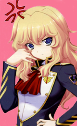
Sorceress, "3rd form":

I drew her on some horrible paper, thus the grey dots that litter the page. But I really embellished her, huh? She has footwear this time! She's leaning against a wall (my first time attempting such a feat) so the perspective is off. Her left eye is misplaced, her right arm looks too short, the fingers look horrible, her feet don't look like they're level on the ground, her clavicles' look slightly strange, and I tried too hard on her skirt. And the perspective on her legs is different from the perspective on the rest of her body.
I'd also like to say that everyone is free to comment on any of the images I've uploaded and not just the latest one.
0
I drew a line beside it with an arrow on it to represent the flow of her thighs. I can recommend you a few books if you want to brush up your skills in proportions and angles. I find these really really useful and helped me tons when i started out. No, its not your normal "how to draw"...
スーパーマンガデッサン†•ä½œç”»ã®ãŸã‚ã®è€ƒãˆã‚‹ãƒ‡ãƒƒã‚µãƒ³
by æž— 晃 (è‘—), æ¾æœ¬ 剛彦, 森田 和明
Publisher: グラフィック社 (2005/10)
ISBN-10: 4766116534
ISBN-13: 978-4766116533
Release Date: 2005/10
スーパーã‚ャラデッサン†•å°è±¡ã«æ®‹ã‚‹æ„図ã™ã‚‹ãƒ‡ãƒƒã‚µãƒ³
by æž— 晃 (è‘—), æ¾æœ¬ 剛彦 (イラスト)
Publisher: グラフィック社 (2007/04)
ISBN-10: 4766117980
ISBN-13: 978-4766117981
Release Date: 2007/04
They're by the same artist who did EVE (æ¾æœ¬ 剛彦) and å¦åœ’ãŠå¬¢æ§˜å¥‡èš (森田 和明). These books really help. I believe スーパーマンガデッサン†•ä½œç”»ã®ãŸã‚ã®è€ƒãˆã‚‹ãƒ‡ãƒƒã‚µãƒ³ has been publish in English called Super Sketches or something you can check it out.
0

I'm not in much of a position of critiquing, but anyway...
from the looks of it, you do improve pretty quickly. I think that's a good sign. I'll think I'll try to manage with the latest picture you did. I think you got the proportions right so far, though the right arm seems to be a bit long in my eyes. The length of the feet could be shorten as it seems to be rather long as well. I think it might have been mentioned before, but yeah, you should try to make smooth lines for female characters. Hopefully, I didn't come off as harsh or if this review was even remotely helpful.
from the looks of it, you do improve pretty quickly. I think that's a good sign. I'll think I'll try to manage with the latest picture you did. I think you got the proportions right so far, though the right arm seems to be a bit long in my eyes. The length of the feet could be shorten as it seems to be rather long as well. I think it might have been mentioned before, but yeah, you should try to make smooth lines for female characters. Hopefully, I didn't come off as harsh or if this review was even remotely helpful.
0
shinkuma wrote...
I'm not in much of a position of critiquing, but anyway... from the looks of it, you do improve pretty quickly. I think that's a good sign. I'll think I'll try to manage with the latest picture you did. I think you got the proportions right so far, though the right arm seems to be a bit long in my eyes. The length of the feet could be shorten as it seems to be rather long as well. I think it might have been mentioned before, but yeah, you should try to make smooth lines for female characters. Hopefully, I didn't come off as harsh or if this review was even remotely helpful.
Is everyone acting like they're walking on needles because of that one post I made? Constructive criticism is definitely welcomed! Anyway, the right arm does look long, but if I had done the perspective on the legs right, that arm would only be slightly longer than it should. The feet are long because I used that long arm as a measure (bad idea). But the length is mitigated somewhat since she is wearing boot-like footwear.
... Ugh. I just realized that it might sound like I'm trying to defend my mistakes. I'm not, I just seem to like explaining things.
@ Mycstea: There's not a chance I'm buying those since I don't even have this. I tend to shy away from importing unless I find something that I must have, like the thing in the link.
0
Trying something new I see, thats a progress. Nah I'm not good with words, I tend to confuse myself when trying to point out mistakes and Shinkuma already stated out the things that can be corrected which crosses my mind when viewing the 3rd form of sorceress artwork that you did.
0

Temcor wrote...
Trying something new I see, thats a progress. Nah I'm not good with words, I tend to confuse myself when trying to point out mistakes and Shinkuma already stated out the things that can be corrected which crosses my mind when viewing the 3rd form of sorceress artwork that you did.Same thing here, and as my english isn't that fluid and i wont be able to give very constructive advices (mainly cause i barely know whtat I am doing) i'll just limit my comments to "i liked this" and "i didn't liked that"
0
So, after nearly three months, lots of work, and 5 JRPGs later, I am showing something old:

When I made this, I didn't really have any character in mind. I sort of used Peach-pit's style with the head, but the eyes are too small and then there's the chin ... And there's the tiny feet. Anyway! This was done with pencil, colored pencils, and a black permanent marker. I simply refer to this girl as Valeira as well because she has long hair and the same color setup of blond, red, and Easter blue as her. Not to mention the slight display of psychic powers present. I was going for the 'windswept look' in this piece.

When I made this, I didn't really have any character in mind. I sort of used Peach-pit's style with the head, but the eyes are too small and then there's the chin ... And there's the tiny feet. Anyway! This was done with pencil, colored pencils, and a black permanent marker. I simply refer to this girl as Valeira as well because she has long hair and the same color setup of blond, red, and Easter blue as her. Not to mention the slight display of psychic powers present. I was going for the 'windswept look' in this piece.

0
*buh buh buh BUUUUUUUMMMMM*
(Or however you do that Zelda-obtained-item sound)

So I have a Wacom Bamboo Fun Small tablet now. And it's blue. My motivation has increased and now coloring things won't be so painful anymore!
(Or however you do that Zelda-obtained-item sound)

So I have a Wacom Bamboo Fun Small tablet now. And it's blue. My motivation has increased and now coloring things won't be so painful anymore!
0
ZeroOBK wrote...
*buh buh buh BUUUUUUUMMMMM*(Or however you do that Zelda-obtained-item sound)
So I have a Wacom Bamboo Fun Small tablet now. And it's blue. My motivation has increased and now coloring things won't be so painful anymore!
Congrats on getting yourself a graphic tablet. Will be looking forward with what you will come up with it...
0
ZeroOBK wrote...
*buh buh buh BUUUUUUUMMMMM*(Or however you do that Zelda-obtained-item sound)
So I have a Wacom Bamboo Fun Small tablet now. And it's blue. My motivation has increased and now coloring things won't be so painful anymore!
Ohh the same model of my tablet =D (but my wacom is black), the painful isn't over my friend to do amazing digital paints you need a lot of hours and pacient, It's a kind of paradox lol
0
Hahaha That's so true roberto, drawing on the tablet is still awkward for me and I have to put the tablet directly in front of the screen todo anything, anyways with those hours of pain will result in improved art work, so its worth the pain :D
