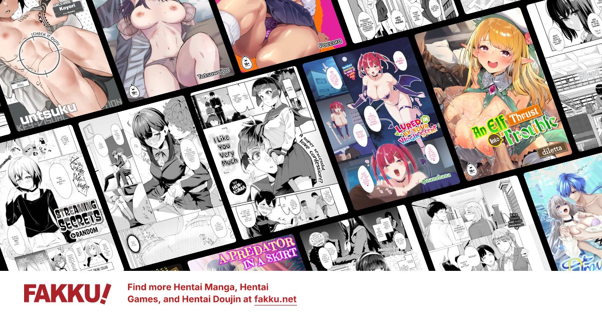
Current (beta I think) homepage feedback and tag suggestions
0
Drifter995
Neko//Night
Bois, the homepage is looking fucking shmick. Good shit.
Come a long way from the classic dated kinda look, to the full on blinding me, to this look. Looks mint.
Now, in regards to suggestions; There's only two tags per thing. This is none good my friendos. The top tags might look delicious, until you go into it, and see ntr (or risk horny jail/ bonks + eternal inner 1,2,2,50, and just jump straight into it, without reading tags further).
I don't know how doable it is, but could hovering over the manga in question bring up the full tags? Or perhaps have just a slider thingo? So, each mango has the two main ones, and you can slide across to see all tags? Or even, having a button next to tags to pop up an in window window of all tags? The in window window does sound the best/ easiest imo. Dear god, don't make it a new window window/ new tab window. Those are the worst.
At least that way you can show a condensed version of the tags, and allow people to see the tags easily without needing to go into it.
Other option is have a shortened version of the tags, down to like two or three letters. So, VN, NTR, FUT, SHM or something. Then have a keyword in the tags section. Cause then you could fit all tags (theoretically) on there, without cluttering it up too much.
I dunno, few ideas at least
0
luinthoron
High Priest of Loli
One thing I miss on the current homepage that used to be there is the book being shown for book chapters, it made adding new releases to the read later list a bit easier each morning.
1
I agree not displaying more than two tags is a misstep.
Artist names should display too imo.
The old format displayed at least two pages from each release which was good for me to gauge the art and decide whether I'm even interested. I wouldn't even bother clicking if the art looked bad in the old format.
Artist names should display too imo.
The old format displayed at least two pages from each release which was good for me to gauge the art and decide whether I'm even interested. I wouldn't even bother clicking if the art looked bad in the old format.
0
Drifter995
Neko//Night
Lenore03 wrote...
I agree not displaying more than two tags is a misstep.Artist names should display too imo.
The old format displayed at least two pages from each release which was good for me to gauge the art and decide whether I'm even interested. I wouldn't even bother clicking if the art looked bad in the old format.
Hovering over, and rotating between two to three images would be a good move I think. Like is common in online stores for products. Should in theory be very easy code to yoink hah
