One Month Later
1

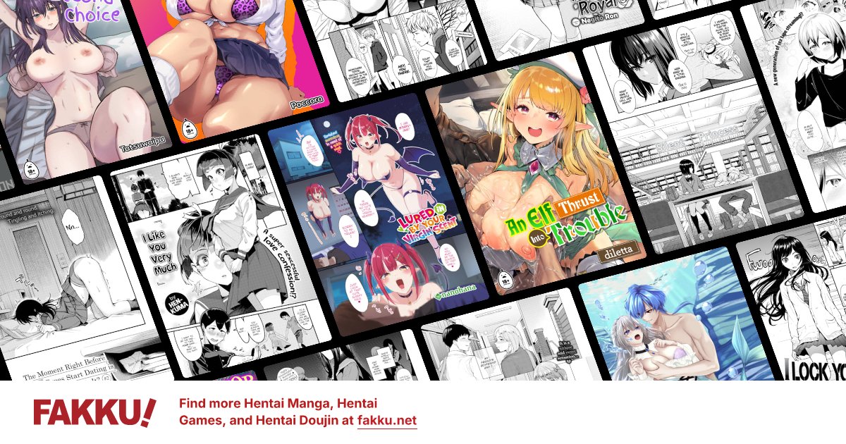
So it's been about a month since the new design went online. Outside of things that haven't been finished yet (mainly the image section), what does everyone think of the new design now that you have gotten used to it?
I want to hear all opinions and suggestions. I want to make the site even better than it already is.
Also the FAKKU! Facebook group now has over 1,500 members! Once that hits 2,000 a random member will get a copy of Blue Eyes Volume 3 so if you haven't joined, you should. I will also be adding a new poll to the front page about watermarks on our releases. Let us know what you think.
Also one of our editors, Mike, is offering up his services for commission. So if you have a manga you would like scanlated go check out his thread.
0
I'm just a little newbie, and I almost never chat, but I lurk a lot-- I actually (to be honest) forgot there was an 'old way.' I think it looks very good-- busy but accessible.
I still liked orange a lot.
I still liked orange a lot.


0
mibuchiha
Fakku Elder

definitely better than the old one...many things are made much more convenient. well, there are some bugs, and weird changes too, but i really like it that bugs are fixed quickly, and also how user feedback is taken seriously.
thanks jacob. you're the best admin i know. ever.
but, i'm still waiting for the emoticon guide...
and stat. i think vertical stat, right under the av is nice but i got used to the horizontal already...and i think horizontal stat takes less space, regardless of the length of users' posts.
thanks jacob. you're the best admin i know. ever.
but, i'm still waiting for the emoticon guide...
and stat. i think vertical stat, right under the av is nice but i got used to the horizontal already...and i think horizontal stat takes less space, regardless of the length of users' posts.

0

Jacob wrote...
So it's been about a month since the new design went online. Outside of things that haven't been finished yet (mainly the image section), what does everyone think of the new design now that you have gotten used to it?I want to hear all opinions and suggestions.
You know me. Any complaint/suggestion/comment from me goes straight into the Feedback/Suggestions forum. It's much better than the old, I'll give you that since the speed is great, but once all the bugs and booboos are fixed, the new site design would be awesome and incomparable to the old.
0
I think the new design is better than the previous one. Maybe it is just... simply amazing? lol
Oh is it just me or the facebook icon is somewhat out of place? ^^
Anyway, you guys did a good job in the new design.
Cheers!
Oh is it just me or the facebook icon is somewhat out of place? ^^
Anyway, you guys did a good job in the new design.
Cheers!
0
I congratulate the team for their strenuous efforts to develop the site. Month after the launch of the new version and correct the mistakes that accompanied the start-up. The current version has become the most beautiful and better and more fun. Thank you very much
0

games sections is a bit confusing at first but it grows on you.
it's all good. It's nice, Better but i would really, like you said ,see the images section back up
any ideas when that could be?
it's all good. It's nice, Better but i would really, like you said ,see the images section back up
any ideas when that could be?
0

100% used to it by now and grateful for all the previous issues it fixed (damn it's nice not to have to log in each time I come back).
Voiced my few (minor) suggestions on F&S and have nothing more to add. If I think of something, you'll be the first to know.
Voiced my few (minor) suggestions on F&S and have nothing more to add. If I think of something, you'll be the first to know.
0

I like it. Everything loads faster, the design is more slick, and we apparently have a rep log.
But, as others have mentioned, vertical stats were better.
Also, I think I preferred it that the last ten posts in a topic were displayed on the bottom when you were replying to a topic. It made it easier to quote multiple people or make a rebuttal to multiple points.
But, as others have mentioned, vertical stats were better.
Also, I think I preferred it that the last ten posts in a topic were displayed on the bottom when you were replying to a topic. It made it easier to quote multiple people or make a rebuttal to multiple points.
0

You guys have done a fantastic job i remember the way the old one looked cuz I'm always on your site, you guys have made this site amazing. I think everyone would agree...
When are the Images gonna be back?
When are the Images gonna be back?
0

I have gotten use to the new design but I think side stats would be better. We had a poll on this a while back I think and side stats were preferred I believe. Underneath our avatars just looks so empty. I also think it just plan look better.
0
Arizth wrote...
I like it. Everything loads faster, the design is more slick, and we apparently have a rep log.But, as others have mentioned, vertical stats were better.
Also, I think I preferred it that the last ten posts in a topic were displayed on the bottom when you were replying to a topic. It made it easier to quote multiple people or make a rebuttal to multiple points.
This can be turned on/off in your user profile. I meant to make it turned on by default, maybe I'll do that now.
0

It's awesome, but yeah, like everyone already said, having your stats under the avatar is prefered.
0
The Banner still same, but who would care about that...
I like the new interface in Hentai and Manga Doujinshi, always sort by series, it more easier than the old.
Now always log me it's working, hate to put pass and id..
BTW, I would be delighted if you put some notice, like how many post, location, things in mind under/besides the avatar...
I like the new interface in Hentai and Manga Doujinshi, always sort by series, it more easier than the old.
Now always log me it's working, hate to put pass and id..
BTW, I would be delighted if you put some notice, like how many post, location, things in mind under/besides the avatar...