0
Saw the sticky for FAKKU Shirts and Apparel and I happened to be bored, so I thought I'd give it a shot...
PROGRESS:
Original Black & White Graphic -
T-shirt Graphic Print Sample #1a -
T-shirt Graphic Print Sample #1a on T-shirt -
T-shirt Graphic Sample #1b -
T-shirt Graphic Print Sample #1b on T-shirt - (NEWLY ADDED)
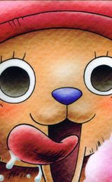
Reference picture for graphic - (Screenshot from Jacob's video on youtube: Fakku Geddan!)
Edit:
Here's a new T-shirt design idea. It's a little simple though.
PROGRESS:
T-shirt graphic print sample #2 -
T-shirt graphic print sample #2 on T-shirt -
Reference picture for graphic:
PROGRESS:
Original Black & White Graphic -
Spoiler:

T-shirt Graphic Print Sample #1a -
Spoiler:

T-shirt Graphic Print Sample #1a on T-shirt -
Spoiler:

T-shirt Graphic Sample #1b -
Spoiler:

T-shirt Graphic Print Sample #1b on T-shirt - (NEWLY ADDED)
Spoiler:

Reference picture for graphic - (Screenshot from Jacob's video on youtube: Fakku Geddan!)
Spoiler:

Edit:
Here's a new T-shirt design idea. It's a little simple though.
PROGRESS:
T-shirt graphic print sample #2 -
Spoiler:

T-shirt graphic print sample #2 on T-shirt -
Spoiler:

Reference picture for graphic:
Spoiler:


0
winter55 wrote...
did you decide to come back now?Are you referring to my thread or just Fakku! in general?
During my absence, I still come back for the hentai but I stopped visiting the forums when I got distracted by school, social life, etc.
Now, I reckon I'll stick around a little more.
0
kitten-in-heat wrote...
winter55 wrote...
did you decide to come back now?Are you referring to my thread or just Fakku! in general?
During my absence, I still come back for the hentai but I stopped visiting the forums when I got distracted by school, social life, etc.
Now, I reckon I'll stick around a little more.
in art general.
0
winter55 wrote...
kitten-in-heat wrote...
winter55 wrote...
did you decide to come back now?Are you referring to my thread or just Fakku! in general?
During my absence, I still come back for the hentai but I stopped visiting the forums when I got distracted by school, social life, etc.
Now, I reckon I'll stick around a little more.
in art general.
I still do art even when I don't post it up. It's kind of a requirement for me when my college course is Fine Arts - Advertising. lol
0
kitten-in-heat wrote...
winter55 wrote...
kitten-in-heat wrote...
winter55 wrote...
did you decide to come back now?Are you referring to my thread or just Fakku! in general?
During my absence, I still come back for the hentai but I stopped visiting the forums when I got distracted by school, social life, etc.
Now, I reckon I'll stick around a little more.
in art general.
I still do art even when I don't post it up. It's kind of a requirement for me when my college course is Fine Arts - Advertising. lol
Lucky... Please post more works to keep the art section alive.. It's nice to see some old threads coming back to life.
0
winter55 wrote...
Lucky... Please post more works to keep the art section alive.. It's nice to see some old threads coming back to life.Sure thing! I'll also probably be scanning some of my recent sketches to contribute to the Fakku Daily Sketch thread. :P
0
artcellrox
The Grey Knight :y

You draw and you write. Not bad. I like the "horror noire" vibe your earlier sketches were giving off. Do you work on them more on your laptop, to add details and to colour, etc.?
And lol, the Jacob design.
P.S., I may be giving a more proper critique to your story someday soon, so I hope you don't mind me necro'ing that.
And lol, the Jacob design.
P.S., I may be giving a more proper critique to your story someday soon, so I hope you don't mind me necro'ing that.
0
artcellrox wrote...
You draw and you write. Not bad. I like the "horror noire" vibe your earlier sketches were giving off. Do you work on them more on your laptop, to add details and to colour, etc.?And lol, the Jacob design.
P.S., I may be giving a more proper critique to your story someday soon, so I hope you don't mind me necro'ing that.
The only digital enhancements I made to the hand-drawn sketches I posted on this thread so far are changing the brightness and contrast so as to make them clearer. I'm still at the very basics when it comes to lineart and digital colouring so I haven't tried digitalizing my previous sketches yet.
The t-shirt designs, on the other hand, were made straight in photoshop and I did them using pen tool--mostly because my friend still has my tablet.
As for my story... lol that was a really long time ago and I never got around to finishing it. But yeah, any constructive criticisms are welcome.
0
Juggle wrote...
Nice work on the horse tshirt XDHaha thanks!! I guess I'll submit that one in the Fakku Shirts and Apparel sticky...Hmm...:3
Here's a new T-shirt design idea! This one mostly caters to fans of the Yandere type.
PROGRESS:
T-shirt Graphic Print Sample #3 -
Spoiler:

T-shirt Graphic Print Sample #3a on T-shirt -
Spoiler:

T-shirt Graphic Print Sample #3b on T-shirt -
Spoiler:

0

Gonna be honest with your shirt designs.
The text is horrible. Try reading up on some typography theory and take some consideration to your design. Don't just choose that text type because "oh it looks nice to me".
For example your "kawaii desu" shirt font:
- Lose the satin/bold outlines, it makes it look unprofessional and gimicky.
- Dont use curly fonts like that. You many think you're doing yourself a favour by picking a "different" font but you're not. Stick to common looking ones; they're commonly used because they are what look and work best.
Think design:
That curly font is hard to read, the purpose of a shirt design is for people to see it and think hey that's cool. Kinda hard if they can't actually read it without staring at for 2 minutes.
If you're using the phrase "kawaii desu" stop and think for a moment. What pops into your head when you think of kawaii? Try to emulate that in what text type and colour/design you choose. To me black is definitely not a kawaii colour, nor does the font or the red/outline seem very kawaii to me either. What that does is it's telling my brain one thing but my eyes are seeing completely different thing. Creates confusion and makes the design look bad.
Just some advice if you want to improve your design. Btw go to dafont.com and pick out some fonts, the default ones a horrible and outside of myrid pro/tomoha/minron pro they're pretty bad.
0
Anesthetize wrote...
Gonna be honest with your shirt designs.The text is horrible. Try reading up on some typography theory and take some consideration to your design. Don't just choose that text type because "oh it looks nice to me".
For example your "kawaii desu" shirt font:
- Lose the satin/bold outlines, it makes it look unprofessional and gimicky.
- Dont use curly fonts like that. You many think you're doing yourself a favour by picking a "different" font but you're not. Stick to common looking ones; they're commonly used because they are what look and work best.
Think design:
That curly font is hard to read, the purpose of a shirt design is for people to see it and think hey that's cool. Kinda hard if they can't actually read it without staring at for 2 minutes.
If you're using the phrase "kawaii desu" stop and think for a moment. What pops into your head when you think of kawaii? Try to emulate that in what text type and colour/design you choose. To me black is definitely not a kawaii colour, nor does the font or the red/outline seem very kawaii to me either. What that does is it's telling my brain one thing but my eyes are seeing completely different thing. Creates confusion and makes the design look bad.
Just some advice if you want to improve your design. Btw go to dafont.com and pick out some fonts, the default ones a horrible and outside of myrid pro/tomoha/minron pro they're pretty bad.
Thank you for the critique!
I wanted to use the website's colour scheme, but the kawaii theme I used definitely doesn't go with it. I'll definitely keep that tip in mind.
The comment about the text definitely caught my attention as it helped me realize how I didn't really think much of it while I was making the design. It's kind of embarrassing for me to forget such an important thing, being an advertising student and all.
I haven't gotten around to downloading fonts from the sites you recommended, but if possible, can I ask your opinion on the new color scheme I used?
Spoiler:

Spoiler: