1

Well, recently I've got myself a tablet so I've been playing around with it. It's actually my first try with digital art so I'm practically new with this whole thing.
Anyway, I decided to show some of my arts here seeing I've been lurking this place forever. I know they are not good lol so opinions and critics are more than welcome ^_^
Here they are:
Update 22 May:
Anyway, I decided to show some of my arts here seeing I've been lurking this place forever. I know they are not good lol so opinions and critics are more than welcome ^_^
Here they are:
Update 22 May:
Spoiler:

Spoiler:

Spoiler:

Spoiler:

Spoiler:


0
ToyManC
Forgot my safe word
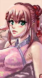
As Sneakyone said, pretty good. I would work on perspective and proportions. The back leg should appear slightly smaller than the one in the foreground. Keep up the good work and keep posting.
0
Sneakyone wrote...
They look pretty good, although the faces seem a bit off, but other than that good work.ToyManC wrote...
As Sneakyone said, pretty good. I would work on perspective and proportions. The back leg should appear slightly smaller than the one in the foreground. Keep up the good work and keep posting.Oh I see, it's hard to realize those mistake by myself -_-
Thanks for your advices, I guess I still have to practice a lot more. I'll try posting more ^_^
0
My suggestion is to draw more :D--traditionally as well as digitally. Also practice from life (or photo reference) of real humans. It will transfer well into anime/manga or whatever stylization of humans you want to do :3.
0
rin^2 wrote...
My suggestion is to draw more :D--traditionally as well as digitally. Also practice from life (or photo reference) of real humans. It will transfer well into anime/manga or whatever stylization of humans you want to do :3.Thanks, I'm pretty much a newcomer in art (started drawing about 3 months ago) so I'm not really sure if I'm on the right track. Anyway, I'll do like you said, keep on practicing ^^

1
Looks pretty good, this one :).
Few things to consider for the next one.
1. Shadows. Right now, everything looks so soft. It makes the image look blurry. Consider adding in harder cast shadows to make things pop more. When you have a light source, it will make objects it illuminates cast a hard shadow. You can easily test this out in RL :).
2. Lighting. What you've chosen for your lighting is very challenging to pull off. I think of many of the lighting schemes, back-lighting is one of the more difficult one. I would recommend working with a light source coming form the top and to the side.
0
rin^2 wrote...
Looks pretty good, this one :).Few things to consider for the next one.
1. Shadows. Right now, everything looks so soft. It makes the image look blurry. Consider adding in harder cast shadows to make things pop more. When you have a light source, it will make objects it illuminates cast a hard shadow. You can easily test this out in RL :).
2. Lighting. What you've chosen for your lighting is very challenging to pull off. I think of many of the lighting schemes, back-lighting is one of the more difficult one. I would recommend working with a light source coming form the top and to the side.
I see, so it's the shadows. I think I overused the blur effect coupled with the fact that I'm not so sure with the shadows in the shirt's wrinkles.
Thank you for your extremely helpful advice. It means a lot to me ^^
0
Hey, nice going there =) I think the feet are a bit too simple though, and would've wished for a bit more refined anatomy there.
Few things to consider for the next one.
1. Shadows. Right now, everything looks so soft. It makes the image look blurry. Consider adding in harder cast shadows to make things pop more. When you have a light source, it will make objects it illuminates cast a hard shadow. You can easily test this out in RL :).
2. Lighting. What you've chosen for your lighting is very challenging to pull off. I think of many of the lighting schemes, back-lighting is one of the more difficult one. I would recommend working with a light source coming form the top and to the side.
Oo great feedback, I agree. Why have you deleted your works on your art thread? ;A; Do you have a deviantArt account?
rin^2 wrote...
Looks pretty good, this one :).Few things to consider for the next one.
1. Shadows. Right now, everything looks so soft. It makes the image look blurry. Consider adding in harder cast shadows to make things pop more. When you have a light source, it will make objects it illuminates cast a hard shadow. You can easily test this out in RL :).
2. Lighting. What you've chosen for your lighting is very challenging to pull off. I think of many of the lighting schemes, back-lighting is one of the more difficult one. I would recommend working with a light source coming form the top and to the side.
Oo great feedback, I agree. Why have you deleted your works on your art thread? ;A; Do you have a deviantArt account?
0
merriment wrote...
Hey, nice going there =) I think the feet are a bit too simple though, and would've wished for a bit more refined anatomy there.Hey, thanks :)
Yes, you're absolutely right. Anatomy is something I also need to work a lot on, too.
Oh and I saw your thread. Your skill really is way ahead of me. I would love to have your advices in the future ^^
0
I think you've got the basics pretty well down already, now it's just the matter of refining it =) I've found that the most enjoyable way to do this is studying your own body and other living people (if possible). Anatomy books and pictures I find a bit boring, feels too much like school =D though those have helped too.
I've been a bit unactive recently, but I like to comment to people that want to improve. I'm glad that you take critique so well, it's so important in terms of improving >.
I've been a bit unactive recently, but I like to comment to people that want to improve. I'm glad that you take critique so well, it's so important in terms of improving >.
0
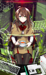
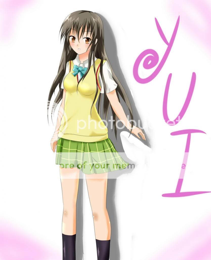
Updating with my fanart of Kotegawa Yui from To love Ru. I chose a simple pose so that I can focus on improving some aspects.
0
Assort_Dis wrote...
Updating with my fanart of Kotegawa Yui from To love Ru. I chose a simple pose so that I can focus on improving some aspects. Ahh thats lovely!
I was going to give some constructive critisism but I can see how you are improving in ever post so all I can say is job well done all around and keep working at it! I dont have too too much knowledge on digital and character art but seems like a lot of people here have some great input that you are listening to!
I can't wait to see more :)
0
UsagiHime wrote...
Ahh thats lovely!
I was going to give some constructive critisism but I can see how you are improving in ever post so all I can say is job well done all around and keep working at it! I dont have too too much knowledge on digital and character art but seems like a lot of people here have some great input that you are listening to!
I can't wait to see more :)
Thanks a lot, I'm happy enough that you're interested in my work :)
And yes, it's definitely thanks to their advices that I can see where my problem is at. I still have much to work on, of course :)
0
UsagiHime wrote...
Anytime!Curious do you draw men at all?
Well... I don't want to...
I did actually draw men before but I kinda lost motivation halfway. I just want to draw cute girls ^^
0
ah yes I can see how cute girls would be more fun!
I was just curious to see if you had worked on other things besides cuties ^-^.
I was just curious to see if you had worked on other things besides cuties ^-^.
0
UsagiHime wrote...
ah yes I can see how cute girls would be more fun! I was just curious to see if you had worked on other things besides cuties ^-^.
Haha, well I must admit it's a bad habit.
I might try to work on drawing men in the future just so my artwork can have more diversity. For now, more girls I guess :)
0
Assort_Dis wrote...
UsagiHime wrote...
ah yes I can see how cute girls would be more fun! I was just curious to see if you had worked on other things besides cuties ^-^.
Haha, well I must admit it's a bad habit.
I might try to work on drawing men in the future just so my artwork can have more diversity. For now, more girls I guess :)
seems like a good plan!
I like to tackle one project on at a time as well. I personaly learn easier that way