8

For the past few months we've been working on a redesign of FAKKU and we're finally ready to make it public! You can turn on the new design, and other beta features, by visiting the following page in your account settings. This will turn on beta features across the website (right now though it's mainly just the redesign). But beware, this is basically my playground for whatever random thing I happen to be working on in my free time. So expect things to be a little broken...
https://www.fakku.net/account/beta
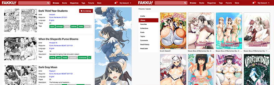
In the coming months this redesign will be the default FAKKU design, so I want to make sure it's 100% solid before it goes live.
Current Design Problems
As time goes on our library of content is going to keep increasing. We need to surface content from our back catalog to users that may not be aware of everything available, we want you to get the most value out of your subscription. It's on us to design ways to surface that content to users, so that you can easily view the massive library FAKKU has rather than just the latest content on the front page.
There's lots of little things we'll be fixing as well. As an example, right now the process of buying a book or doujin is a little wacky and we don't have it built into the main site in a friendly way. We'll fix that. Or did you know you can search for multiple tags at the same time? We do a bad job showing how to do that.
This redesign gives us the freedom to fix these problems and add a lot more features to FAKKU, and we have a long long list of new features we are planning to work on.
Why redesign FAKKU?
FAKKU was designed over 10 years ago and honestly, our design hasn't changed much in that time. That's a good thing, it means we were able to achieve the goals of our previous (existing) design. That goal was to help bring hentai to a larger international audience and to give scanlators a platform to do so. Now that we are both a publisher and a service, our design needs to change to reflect that. FAKKU can't, and shouldn't, look like a scanlation website. We owe it to ourselves, our users, and our partners in Japan, to make FAKKU look and feel like something more (because it is).
This is our first step!Let me know what you think of the design in this thread or join our Discord channel and talk with us directly.
If you run into any bugs or have any suggestions (not feature requests), let me know!
2
GODsHandOnEarth
(Not-so-)Grim Reaper

*cough* Beta Tester Achievement *cough*
I must say I like fancy redesigns, even if they give you no other functions!
In Regards to new functions here are my five cents what would be great functions:
-option to enable the showing of thumbs once one clicks the read button
-option to read the whole magazine from start to finish in one go
-option to show thumbs for books
-option to download magazines/option to buy completed magazines
Update: Didn't read the last line stating that we shouldn't give feature suggestions...
Bad boy, GODsHand! Very bad!
And thank you for disabling the preview pages under the chapters, it really annoyed me....
0
luinthoron
High Priest of Loli

I think I'll wait until it's ready to release this time after the trouble with the accidental beta the last time. I did notice at that time (but I believe I never got to this bit in my thread then) that parody material was missing the indication of parodied series on the main page, though.
1
Dashiell
DirtyDeedsDunDirtCheap

Let's see, I will be nitpicking now.
Entering book's page no longer displays tags of individual chapters, shame,
Lack of site's frame and dividing lines on forum feels strange,
Actually everything is lacking dividing lines, it makes reading harder,
On book's page it's still written "Do you like this chapter?" in comments field,
Color tag could really use new image,
Since main page is so longcat you could fit way more book adverts on the right.
Where do we put line between suggestion and request? :P
Anyway as I have already said I'm fan of organizing by tabs (RIP that thread) especially now that our Library grew but new users still won't see huge part of it if they don't visit store page directly so adding Doujinshi tab to Library where all un/bought doujins are like with Books would be good to have.

1
Dashiell wrote...
Lack of site's frame and dividing lines on forum feels strange,Actually everything is lacking dividing lines, it makes reading harder,
Yeah at first it felt weird to me too, but it was intentional. I want to remove as many boxes, borders, and dividers as possible and then re-introduce them only when necessary.
0

Yeah, a redesign of the purchase method would be good, like a way to upgrade from digital to physical easily without having to send an email every single time. I bet you already thought of that.
And YES!! I always like redesigns :DDD 150% of my support on that. I already switched to beta version.
And YES!! I always like redesigns :DDD 150% of my support on that. I already switched to beta version.
1
Spartanlugge
defends the Lolis

Also like the new design. What about a second version with a dark backround area.
Btw the backround colors of the Brewmaster and Mega Milk achievments are missing.
Btw the backround colors of the Brewmaster and Mega Milk achievments are missing.
0

Not 100% sure if this is the right place for this, but have some overlapping on the home page from the title being so long.

0
waterflame
FAKKUDL.NET

New theme seems to break at least my signature. Well more specifially it seems list aren't displaying right. I'd test the Sig more but I can't press any buttons on https://www.fakku.net/account/edit.
It should look something like this:
Oh you also can't open Spoilers in the preview(but then I believe that was the same in the old design). I also could of sworn there was a code tag... here is my Sig code - http://pastebin.com/SNLsv6fT
Browser: Chrome/56.0.2924.87
It should look something like this:
Spoiler:

Oh you also can't open Spoilers in the preview(but then I believe that was the same in the old design). I also could of sworn there was a code tag... here is my Sig code - http://pastebin.com/SNLsv6fT
Browser: Chrome/56.0.2924.87
0
GODsHandOnEarth
(Not-so-)Grim Reaper
waterflame wrote...
New theme seems to break at least my signature. Well more specifially it seems list aren't displaying right. I'd test the Sig more but I can't press any buttons on https://www.fakku.net/account/edit.It should look something like this:
Spoiler:
Oh you also can't open Spoilers in the preview(but then I believe that was the same in the old design). I also could of sworn there was a code tag... here is my Sig code - http://pastebin.com/SNLsv6fT
Browser: Chrome/56.0.2924.87
If you want to change your signature you have to click somewhere outside the the text field of the signature but not on other buttons. This should turn the update signature button green and you can save the changes. Had the same problem, seems to work this way...
1
BitNdragon
More Than A God

Overall I like the look for the new site; the front page looks nice, I love being able to browse my library easier with the smaller pics, and the comments section flows better.
A couple improvements could be made besides technical things. I would like a dark theme to be added I feel like it would be nice on the eyes. Lastly I feel the forums are too large I like it for the comments section, but the forums are more for discussion and I think the previous format looked better for those longer posts.
Overall I feel like the new format is a win though glad to see you guys making improvements to the site :)
0
waterflame
FAKKUDL.NET
GODsHandOnEarth wrote...
If you want to change your signature you have to click somewhere outside the the text field of the signature but not on other buttons. This should turn the update signature button green and you can save the changes. Had the same problem, seems to work this way...
Ah! Thank you. Though should it also be toggling the "Update Avatar" button?
1
GODsHandOnEarth
(Not-so-)Grim Reaper
waterflame wrote...
GODsHandOnEarth wrote...
If you want to change your signature you have to click somewhere outside the the text field of the signature but not on other buttons. This should turn the update signature button green and you can save the changes. Had the same problem, seems to work this way...
Ah! Thank you. Though should it also be toggling the "Update Avatar" button?
Well, maybe both buttons are friends and only wan to show up together...
0
waterflame wrote...
GODsHandOnEarth wrote...
If you want to change your signature you have to click somewhere outside the the text field of the signature but not on other buttons. This should turn the update signature button green and you can save the changes. Had the same problem, seems to work this way...
Ah! Thank you. Though should it also be toggling the "Update Avatar" button?
oops :p I'll fix that.
1
Drifter995
Neko//Night

The overlap with some still happens if you haven't purchased the book/ chapter either.
My only gripe with it so far, is it seems rather basic, and almost mobile orientated. Which isn't a bad thing by any means, but yeah, just feels a bit bland. It's not bad though. So far it's pretty easy to navigate, and haven't had any issues.
Does almost remind me of facebook though. The ivoryish background, with all the forum bits in the centre, and then the bar up the top (which I mean, is a fairly generic layout in itself, not limited to facebook/ not created by facebook), but yeah. Though, the colours are better than facebooks by miles. Less boring in that regard
1
On book's page it's still written "Do you like this chapter?" in comments field,
Btw the backround colors of the Brewmaster and Mega Milk achievments are missing.
Oh you also can't open Spoilers in the preview(but then I believe that was the same in the old design). I also could of sworn there was a code tag... here is my Sig code - http://pastebin.com/SNLsv6fT
New theme seems to break at least my signature. Well more specifially it seems list aren't displaying right. I'd test the Sig more but I can't press any buttons on https://www.fakku.net/account/edit.
These should all be fixed!
0
Shiroyama
Homonculus' Groupie

GODsHandOnEarth wrote...
The notifications aren't working on mobile devices.I can also verify this.
2
Gravity cat
the adequately amused

I like the new design.
But I do have some minor gripes
- At last the text box listing all available tags was removed from the top of the Tags page; as convenient as it was to see all the tags available on F! without having to scroll, it looked awful.
- Read History and Read Later pages are no longer completely useless; rather than a list of titles I can see thumbnail examples so I don't have to navigate to the manga's page to see what it is.
- Notifications each have an icon depending on what it's coming from; Tag subscriptions, Up/downvotes and Reps, and Quotes and topic responses.
But I do have some minor gripes
- There's a lot of unused space on the right side of the main site page now that it's been extended. Can use it to advertise some Books or something.
- The page navigation numbers on a post. Right now there's a box missing from the current page you're on and it looks a bit odd, and can be a bit confusing on posts with only two pages. Would it be better to have a darker box around the current page you're on?
- Might need a couple more icons for notifications. Reps and comment votes use the same icon yet are two different things, for example.
- Previewing a post is pretty awkward. It's always been awkward, but now the text edit box fills up the page and there's no real indication on the page other than the Scroll bar changing sizes that a preview has been generated. Maybe a yellow box saying "Preview generated!" and a slow automatic scroll upwards would be a good idea?
- I don't know how I feel about the forums lacking dividing lines. It doesn't make reading any harder, at least for me, but it does feel like there's something missing from the page overall.
- In fact the forums as a whole feel a little odd.
- These last two are a little unrelated to the new design, but the colour tag still uses that image of a colour test card. Looks a bit out of place. Since all other Tag thumbnails use B&W images as examples it makes sense to use an actual manga example.
- I don't really see much point in the Create Poll button anymore. Would it be easier to have a tick box on the Create Topic page on whether you want a Poll on it or not?