0
Antw0n
Remember me?

I've never been a fan of the oversimplifying update meme that everything ever has been doing for the past 5 years, but its not terrible.
At least its not Skype.
[size=10]Personally my favorite is still the original design with the cool pink paint splatters.[/size]
EDIT

The white on light-grey with no borders is triggering my autism. It looks like its unfinished, or like something failed to load.
At least its not Skype.
[size=10]Personally my favorite is still the original design with the cool pink paint splatters.[/size]
EDIT
The white on light-grey with no borders is triggering my autism. It looks like its unfinished, or like something failed to load.

0

AzelleFans wrote...
The reply button when viewing private message is missing. Please add it back.Agreed with AzelleFans here. I was intending to reply to some private messages but I couldn't find the reply button anywhere. :(
0
Papa Nito
Enemy Stand

I haven't payed much attention to my comment, and forum reputations in a while, did they merge?
I second this.
Fudgehog wrote...
"Read history" and "Read later" chapters are now displayed as pictures. I like it.I second this.
0

Gambler wrote...
AzelleFans wrote...
The reply button when viewing private message is missing. Please add it back.Agreed with AzelleFans here. I was intending to reply to some private messages but I couldn't find the reply button anywhere. :(
Is this button visible?
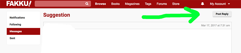
0
Dashiell
DirtyDeedsDunDirtCheap

Jacob wrote...
Is this button visible?
Yeah it's visible, I guess including myself everyone was searching for it at the bottom like on forum, it would be nice to have it here.
Accidentally I found out that clicking on date on message takes you to forum post with the same number.
0
Jacob wrote...
Gambler wrote...
AzelleFans wrote...
The reply button when viewing private message is missing. Please add it back.Agreed with AzelleFans here. I was intending to reply to some private messages but I couldn't find the reply button anywhere. :(
Is this button visible?
My mistake. I meant the button doesn't appear in the old version, not the beta one.

1
Smuggins
Just Some Guy

The 'read later' button has disappeared, at least for me :( I tried searching the page for it, just in case it moved, but no luck!
Also, I no longer see the ability to give rep! I found it! And like that it is consistent with comments now, cool!
Also, I no longer see the ability to give rep! I found it! And like that it is consistent with comments now, cool!
0
oppaiknight
From the Cleave Age

Smuggins wrote...
The 'read later' button has disappeared, at least for me :( I tried searching the page for it, just in case it moved, but no luck!This.
0

Design looks nice, though I would add one more thing. On the front page, why not have releases go 2 across on the page? I think a lot of us now browse in windows wide enough to be able to do that. Oh and is it just me or is the read later option gone? That was a nice little feature :(
1

JupitersSon wrote...
Design looks nice, though I would add one more thing. On the front page, why not have releases go 2 across on the page? I think a lot of us now browse in windows wide enough to be able to do that. Oh and is it just me or is the read later option gone? That was a nice little feature :(Something like this you mean (open spoiler)?
Spoiler:

It could be done, but I think having a single narrow-ish column is the popular style these days. It's easier for your eyes to focus on one thing at a time.
1
polwath
Who cares?

For me, It's look cleaner, more modern and flat, and very easy to use as old design. But it look site get smaller make a bit harder to watch.
Only problem are: no read later function anymore and notification doesn't work.
I hope you should be fix it quickly.
Only problem are: no read later function anymore and notification doesn't work.
I hope you should be fix it quickly.
1
ChrisBRosado123 wrote...
JupitersSon wrote...
Design looks nice, though I would add one more thing. On the front page, why not have releases go 2 across on the page? I think a lot of us now browse in windows wide enough to be able to do that. Oh and is it just me or is the read later option gone? That was a nice little feature :(Something like this you mean (open spoiler)?
Spoiler:
It could be done, but I think having a single narrow-ish column is the popular style these days. It's easier for your eyes to focus on one thing at a time.
Yes, that's exactly it! Thanks! Perhaps adding a button that lets you sort the items into either a list, as it is now, or a grid going 2 across, would be an option. Or put the setting in the account settings page.
0

Since the sample thumbnails are gone I would suggest an option in the settings to let you decide to turn them on or off.
For myself I do like them so I would be very sad if they are gone ;o)
For myself I do like them so I would be very sad if they are gone ;o)
0
Papa Nito
Enemy Stand
Smuggins wrote...
The 'read later' button has disappeared, at least for me :( I tried searching the page for it, just in case it moved, but no luckI can't see it either.
0
Smuggins
Just Some Guy
I mean, I could create my own collection called 'Read Later' if that was the intent. I guess I could get used to that.
0
jiggjiggaman
Warship Fucker

I miss the read later feature too. Maybe there's some functionality issue? I hope it returns soon.
If I had one suggestion, I just like seeing more pretty pictures on the screen.
The advert on the side is pretty cool and accomplishes this. Maybe if the new releases were put in the middle with another ad on the left so the new chapters would be flanked on both sides by nice art? If that happened I think it would be better if they didn't move when you scrolled through the new stuff.
edit: Haha I forgot to say it in the beginning, but I like the new look overall as well.
edit 2: Also, I just thought about it, but if the chapters are moved closer to the center, which I think would be more visually pleasing anyway, it also puts the preview art in a good place to catch the eyes of people who are browsing the front page. In my opinion at least.
0
geemaa
<3 Yuri
Small problems I've had so far:
-Add/Remove read later is missing?
-Cannot edit/delete empty collections
-fakku.net/acount/beta feels like it should be listed under the settings menu but thats just for ease of finding it
-profile pictures not displaying for me on the profile page
-I wish you could click forum posts on profile page to get to the topic
other than those small issues everythings great!
p.s. I use the mobile webpage (android)