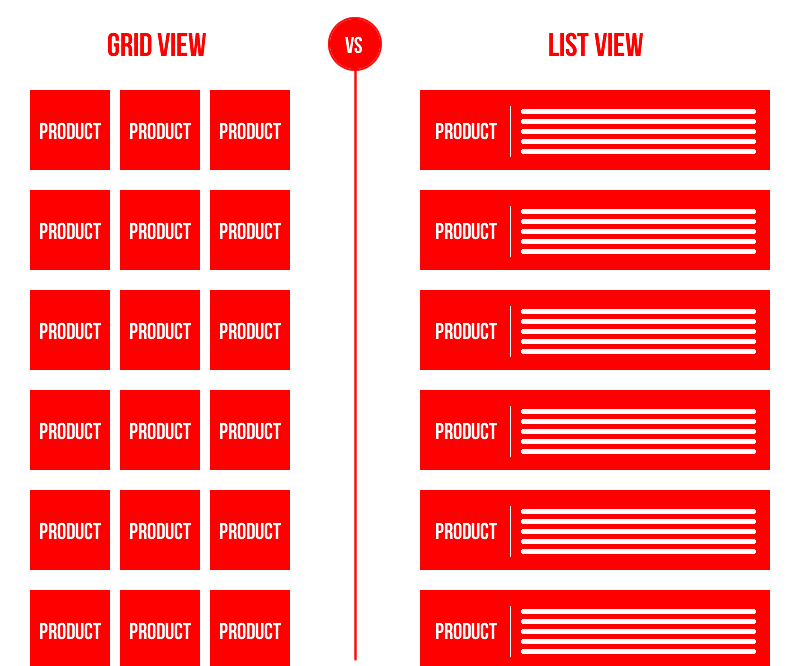
Which type of layout would you prefer on FAKKU?

3

I like having options. My first thought is that list is better because you can see tags at a glance. I think this is very important to me, but I'm not 100% sure. Maybe I wouldn't miss it as much as I think.
However the front page has also become crowded with many different types of posts. I understand there are reasons for this and I'm not inherently opposed to it, but I feel it's becoming unwieldy. For that reason I would be willing to try a grid and see how I feel about it.
If you're not willing to try an implementation without a consensus, I would say just stick to the list.
4

I personally like reading summaries and tags and would find that harder to do if it was in the grid format. Pictures just don't cut it for me. I need a little more depth.

3
ryamain
Myaaah!

Personally, I feel list view is easier to see the new releases. However i think the popular thing should be a grid view as it clutters the front page a bit. Pehaps when searching for something use grid view since people already generally know what they are looking for whereas front page should be list view to have more detail to draw people into the newer release.
0
GODsHandOnEarth
(Not-so-)Grim Reaper

Well... I'm used to the list layout so I cannot really say which one I would prefer without testing both...
On a side note: is it possible to bring back a grid with all thumbs of the story? In the process of upgrading the reader it somehow vanished and I miss it a bit...
On a side note: is it possible to bring back a grid with all thumbs of the story? In the process of upgrading the reader it somehow vanished and I miss it a bit...
4
Drifter995
Neko//Night

Grid view would be good if when you hovered over, it showed you tags and a brief description.
Otherwise, list
Otherwise, list
0
AssasinZAssasin
Not Hentai Protagonist

I really can't say for sure as I've not seen what an implemented 'Grid' style would look like, but I'm sure many are already used to the list format so not changing anything is definitely a valid option.
1
Gravity cat
the adequately amused

List view is good for mobile and it feels clean. Plus it's the kind of format the site's used for nearly a decade. It shows most of the necessary information and it just works.
Grid view is a very jarring difference because the site's used List view for so long, and I worry that showing only the product without showcasing information will do more harm than good. This can be remedied with a hover-over box which pops up with more crucial bits of information, such as tags, the artist, and magazine it was published in, then that'd be boners points. It can potentially showcase more content without using so much vertical space, and can perhaps even make room for other elements of navigation or Book advertising to the site - sort of like a typical hentai-anime site - I think I'd be down for that.
I'm going to be a little greedy and say both; each have their pros and cons. Perhaps make it a toggle-able option using buttons on the main page. That's if it's technically viable and isn't too much of an issue for site development times.
I voted I don't care because I like both in concept. But if I were forced to pick just one, if a hover-over box pops up with the necessary information, I'd lean more towards grid.
-1
List. I guess? Since I can see the tags, and stuff. I want to avoid certain fetishes like snuff,gore,shit,evil endings,etc.
-1
I mean I'm an avid believer of "if it ain't broke don't fix it" which leads me to my next statement, just like the "what's popular right now feature" you implemented, which is how many times do we have to teach you this lesson old man?
0

I'm not sure which I prefer without using the grid for a bit, but someone mentioned being able to toggle them would probably be the best option. Another user mentioned hovering over a grid icon would bring up the summary/tags which would also be great.
0

I like the current list layout because it's subscription-based nature of Fakku with almost daily releases. The layout feels like a feed with the most recent releases on top. If Fakku changed the way it does releases, I could see my preference to a grid layout. I tend to like grid layouts for browsing through catalogues or libraries of content. But for now, I like the list.
0
Papa Nito
Enemy Stand

I feel like Grid only works on desktop where you can hover over the pictures for more details. Otherwise, I'd go with list. Especially since you can't really hover on mobile, or app.
0
ShinTai
The Harem God
For Fakku, it would definitely be List View because instead of looking at the Photos of the comic or manga without the in-depth description, I may end up in unwanted territory. I prefer list view because I want to know what I am looking at before I get into the manga. I would say the Grid View would be useful for the Anime / Hentai Videos.
0

I personally would like a list view. I am already accustomed to scrolling up and down with Fakku's current view which is or is similar to a list view. A grid view doesn't give enough description vs a list view. Although I do appreciate Fakku trying out new things.
2
ntfakku
Reads & Collects Stuff

I'm ok with list, but my personal taste prefers grid...
If anything, perhaps there can be an option to choose between the two?
If anything, perhaps there can be an option to choose between the two?
0
Minikai
Play Umineko :)

Given the speed of releases, I think the current list view is more than enough, specially since it does let you see tags. That said, the current list layout also feels a little cluttered to me, so I'm all for anything that would clean it up some.