Coloring [Thoughts?]
0

Well, I decided to take a whack at it (no pun intended) and I
turned this;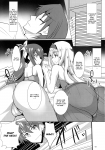
into this;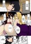
Any thoughts? This is the manga that I may or may not completely color and possibly uncensor: https://www.fakku.net/viewmanga.php?id=6984
turned this;
into this;
Any thoughts? This is the manga that I may or may not completely color and possibly uncensor: https://www.fakku.net/viewmanga.php?id=6984
0

I think that the colours are a bit sharp somehow. and don't you think that removing these spot like things would be good?
0
mochure wrote...
I think that the colours are a bit sharp somehow. and don't you think that removing these spot like things would be good? Do you mean where the "light" hits?
0
Enek wrote...
mochure wrote...
I think that the colours are a bit sharp somehow. and don't you think that removing these spot like things would be good? Do you mean where the "light" hits?
I am not sure to what you are referring to. But what I meant was that the colours makes the manga seems more like a marvel to me. and about the black spots (shadow.) shouldn't you remove them and draw a real shadow?
0
mochure wrote...
Enek wrote...
mochure wrote...
I think that the colours are a bit sharp somehow. and don't you think that removing these spot like things would be good? Do you mean where the "light" hits?
I am not sure to what you are referring to. But what I meant was that the colours makes the manga seems more like a marvel to me. and about the black spots (shadow.) shouldn't you remove them and draw a real shadow?
Okay, now I understand what you mean.
I tried, but I failed horribly and I just ended up giving up. >,>
1
Oh... okay. I just thought that it was possible to do better. but frankly this one is rather good.


![Coloring [Thoughts?]](https://img.fakku.net/w7kTvLFyUbCyjI7lCIYgH7-_kov0EUxFMK6rFkmudUM/w:1200/h:630/rt:auto/g:sm/f:jpg/aHR0cHM6Ly93d3cuZmFra3UubmV0L2FwaS9vZy91bmxpbWl0ZWQ_dD0xNzYyNzY4ODAw.jpg)