My Ronin Art!!

1
I know I can be dull and boring but i like that also I am cheap really under the dirt cheap cause its eithe bills or a Pad and i like the fact i can have a roof over my head! SO critique me so i may feel the sexy you all have! Please love my work(well so called).
I am hoping that every one who even visits leaves a comment on the art !!
PLEASE!!!! LEASE ONE!!! It helps build character!
seriously not just mine but the things drawn by me.!!
I am hoping that every one who even visits leaves a comment on the art !!
PLEASE!!!! LEASE ONE!!! It helps build character!
seriously not just mine but the things drawn by me.!!
0

really nice drawing I like the colors you picked and the way you did made it stand out bold and original at least to me XD.
Ok that been said try and define your lines to the best you can they seem rather to thick and bit unclear when you also have colors on it. Anatomy that indeed needs work i suggest you might want to fix her bottom (ass) up so it looks more attractive hmmm... I think that's the only issue I see and also colors are to plain try and have some shades if you can. Practice practice practice makes perfect and improves your art in time. ^^
Ok that been said try and define your lines to the best you can they seem rather to thick and bit unclear when you also have colors on it. Anatomy that indeed needs work i suggest you might want to fix her bottom (ass) up so it looks more attractive hmmm... I think that's the only issue I see and also colors are to plain try and have some shades if you can. Practice practice practice makes perfect and improves your art in time. ^^
0

Color work is nice just like Clotho said. Background seems like off compared to the girl. Not sure if you done with it or not but keep up the work.
1
focus more on the girl then the background since the person or characters in most cases need work but yeah... keep up the good work looking forward to more of your art style XD
0
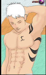
Face and breasts are good hmm It could be me but she looks buff ? her body is good as well just her arms and neck seem to big for her... I suggest try and make them skinnier to have that more feminine look.
0
ClothoBuer wrote...
Face and breasts are good hmm It could be me but she looks buff ? her body is good as well just her arms and neck seem to big for her... I suggest try and make them skinnier to have that more feminine look.Adding onto what Clotho wrote, I think the eye spatial proportion is off. But nice anatomy study on the body, only issue is like Clotho stated for females try and make them more skinny and not so buff looking or the gender will be doubted.
0

Thanks for showing off your work! :) You asked for some critique, so I hope you don't mind if I comment a bit on your latest drawing.
The biggest issue here is definitely anatomy. Without proper anatomy, trying to draw clothes on top of the body becomes nearly impossible to do right. What I usually like to do is first sketch the body lightly, and then draw the clothes over it. This helps to give a sense that the clothes are actually conforming to the body instead of kind of hanging in limbo.
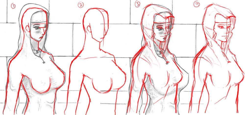
I did a quick red line for you to help point out what I mean. In images 1 and 2 I drew out what the clothes are telling me about the figure. I think the size of the breasts are just fine, but it looks like her chest is bulging out too much. Her shoulders seem a bit low, and the right side of her body doesn't really respond to how her back is arched.
In 3 and 4 I took the liberty of making some corrections and showing the end result. I don't exactly know what a hooded robe is like, but it'd be a good idea to do some studies of real ones. I wasn't sure if you were going for loose or tight clothes, so I left the body vague.
Some tips on the face- make sure your features line up. In image 1, you can see how her right eye is much lower than her left. All facial features usually follow the same slant, so if her head is perfectly straight, make sure all her features line up on a straight line (remember to take perspective into account)!
In image 2 I drew a center line to show that you drew her chin a bit too far back. Nose length and how far down the mouth is is usually up to preference, but I just drew it the way I like it in image 3 and 4. :P
Really, you just got to keep on practicing! Draw from life, draw from pictures if you have to, just draw and study!
I hope that helps! Keep up the good work! :)
The biggest issue here is definitely anatomy. Without proper anatomy, trying to draw clothes on top of the body becomes nearly impossible to do right. What I usually like to do is first sketch the body lightly, and then draw the clothes over it. This helps to give a sense that the clothes are actually conforming to the body instead of kind of hanging in limbo.
I did a quick red line for you to help point out what I mean. In images 1 and 2 I drew out what the clothes are telling me about the figure. I think the size of the breasts are just fine, but it looks like her chest is bulging out too much. Her shoulders seem a bit low, and the right side of her body doesn't really respond to how her back is arched.
In 3 and 4 I took the liberty of making some corrections and showing the end result. I don't exactly know what a hooded robe is like, but it'd be a good idea to do some studies of real ones. I wasn't sure if you were going for loose or tight clothes, so I left the body vague.
Some tips on the face- make sure your features line up. In image 1, you can see how her right eye is much lower than her left. All facial features usually follow the same slant, so if her head is perfectly straight, make sure all her features line up on a straight line (remember to take perspective into account)!
In image 2 I drew a center line to show that you drew her chin a bit too far back. Nose length and how far down the mouth is is usually up to preference, but I just drew it the way I like it in image 3 and 4. :P
Really, you just got to keep on practicing! Draw from life, draw from pictures if you have to, just draw and study!
I hope that helps! Keep up the good work! :)
0
You are an artistic genius =]. I love your work and I think that you should make your own doujinshi =]
0
ClothoBuer wrote...
Face and breasts are good hmm It could be me but she looks buff ? her body is good as well just her arms and neck seem to big for her... I suggest try and make them skinnier to have that more feminine look.Your nack to find these flaws surprise me! i am always happy to read what you see that is off.As for the slenderness, I see i shall look more deeply into that. Thank you again !
lelouch20 wrote...
Adding onto what Clotho wrote, I think the eye spatial proportion is off. But nice anatomy study on the body, only issue is like Clotho stated for females try and make them more skinny and not so buff looking or the gender will be doubted.You mean that futa thing?
Sorry, I am very bad. I draw men far better than women,(My avatar I drew that! digital detailing was from the GIM i tired real hard to make work) I only started drawing women better 3 months ago. A year before, I would try once or twice and give in to me lack of female detail.
yagaminoue wrote...
Thanks for showing off your work! :) You asked for some critique, so I hope you don't mind if I comment a bit on your latest drawing.The biggest issue here is definitely anatomy. Without proper anatomy, trying to draw clothes on top of the body becomes nearly impossible to do right. What I usually like to do is first sketch the body lightly, and then draw the clothes over it. This helps to give a sense that the clothes are actually conforming to the body instead of kind of hanging in limbo.
I did a quick red line for you to help point out what I mean. In images 1 and 2 I drew out what the clothes are telling me about the figure. I think the size of the breasts are just fine, but it looks like her chest is bulging out too much. Her shoulders seem a bit low, and the right side of her body doesn't really respond to how her back is arched.
In 3 and 4 I took the liberty of making some corrections and showing the end result. I don't exactly know what a hooded robe is like, but it'd be a good idea to do some studies of real ones. I wasn't sure if you were going for loose or tight clothes, so I left the body vague.
Some tips on the face- make sure your features line up. In image 1, you can see how her right eye is much lower than her left. All facial features usually follow the same slant, so if her head is perfectly straight, make sure all her features line up on a straight line (remember to take perspective into account)!
In image 2 I drew a center line to show that you drew her chin a bit too far back. Nose length and how far down the mouth is is usually up to preference, but I just drew it the way I like it in image 3 and 4. :P
Really, you just got to keep on practicing! Draw from life, draw from pictures if you have to, just draw and study!
I hope that helps! Keep up the good work! :)
This one tickled my fancy a lot.
I tried drawing from life. It makes me wish i were not born.
There is a specific style i am trying to issue as my own. But your points are seen. Perspective is key i believe, that was where i went wrong.
Red lining my work was fun to look at.
I saw you horizontal it. i was actually going for a tall persons perspective of her. But alas it need work.
Thank you!
GracefulDiscension. wrote...
You are an artistic genius =]. I love your work and I think that you should make your own doujinshi =]I find this hard to respond to for i am slightly warm in face after reading it.
I am thankful you think it is good !
I just need to figure out certain things and maybe i will get there someday.
0
OMG~ It's a Euro-Trash Skank!!!!!! I'd wear that green dress any day XD
Ahem.... anyway, you need to improve your figure drawing skills.
The composition of the pencil drawing is beyond boring but that is partially because of the gesture of the figure, not so much the placement. yagaminoue has given you some pretty good advice on the figure, but imma add to that: observe people, ask someone to take the pose for a few minutes, be a stalker... whatever, looking at the body is the best way to learn the anatomy.
Also, the shading of the pencil pic implies space and that means- if you have it in the figure, you should have it around it too.She is standing next to a wall- how close?, where is the light source?, where does her shadow fall?. The last one's important because shadows describe the weight and placement of objects in space- keep that in mind.
Lastly....
Please love my work(well so called).
...wtf? saying that is not gonna make me feel any different about your art. Working to improve, however, might actually make me like it. <--- that's what i call success
0
What you may see below is me tinkering with the style i got. some of them are old workings i did and some are new.


What did you think about them?
What did you think about them?
0
Colonel☆Sovalkova wrote...
OMG~ It's a Euro-Trash Skank!!!!!! I'd wear that green dress any day XDAhem.... anyway, you need to improve your figure drawing skills.
The composition of the pencil drawing is beyond boring but that is partially because of the gesture of the figure, not so much the placement. yagaminoue has given you some pretty good advice on the figure, but imma add to that: observe people, ask someone to take the pose for a few minutes, be a stalker... whatever, looking at the body is the best way to learn the anatomy.
Also, the shading of the pencil pic implies space and that means- if you have it in the figure, you should have it around it too.She is standing next to a wall- how close?, where is the light source?, where does her shadow fall?. The last one's important because shadows describe the weight and placement of objects in space- keep that in mind.
Lastly....
Please love my work(well so called).
...wtf? saying that is not gonna make me feel any different about your art. Working to improve, however, might actually make me like it. <--- that's what i call successThank you for your innovative response. <B your avatar!
0
Your latest pictures aren't half bad dude. They are very nicely done. I believe you had made a thread on how you use pencils and not a tablet. So you get major props for doing that with your pencil only. Also your latest pictures give me the impression that you really have studied the human body. You can draw the body so well.
0
lelouch20 wrote...
Your latest pictures aren't half bad dude. They are very nicely done. I believe you had made a thread on how you use pencils and not a tablet. So you get major props for doing that with your pencil only. Also your latest pictures give me the impression that you really have studied the human body. You can draw the body so well.Thank you I am trying my best, earning to get better .
0
ClothoBuer wrote...
wow I like them especially the lovers they look good together XDthank you! They were a worthy draw. It was such a joy to do them up. And they came out my head too. XD
GracefulDiscension. wrote...
Nice job bro just try make the outlines less apparent.I am still not sure how to do that. I still try to clean my work before posting it, what you see at times when they look decent is all the cleaning possible. MS IM does so much.
I will hope Gimp helps me out more later on.
0


[size=22]they took a good long time to do...
comments and critiques could assist me on my merry way![/h]
0
I can see you tried to use a new style of or something with coloring maybe? The legs seem a bit plain to me. Also if it weren't for the lips on the demon girl, then I would have though it was a demon boy. Put more emphasis on her chest to make her be noticed that she is a female. Background seems plain, but again I'm guessing you trying something new. Keep at it.
P.S. Try not to double post.
P.S. Try not to double post.