Which background?
Which background is more appealing to you?
0

I'm testing something new and I need some feedback, so please, if its ok with you, can provide me some help here?
Note: I'm not asking which wallpaper use on my computer, I made these two images, and I did both BG. I want to get some feedback so I could decide wich one use more often in my drawings.
Which background do you find more appealing and why?
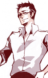
Semi-dark, detailed background (my default):
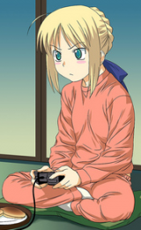
Refreshing, traditional looking background (just acquired):
I would be really grateful if you can provide a detailed opinion about what do you think about them.
Note: I'm not asking which wallpaper use on my computer, I made these two images, and I did both BG. I want to get some feedback so I could decide wich one use more often in my drawings.
Which background do you find more appealing and why?
Semi-dark, detailed background (my default):
Spoiler:

Refreshing, traditional looking background (just acquired):
Spoiler:

I would be really grateful if you can provide a detailed opinion about what do you think about them.

0
I always go with the darker ones, especially since theres windows 7 now, it really matches the futuristic style of it (even thou i mainly use xp) and i like it more detailed. Also if its dark you can tune your contrast on the monitor up to see better. If you do it with the other one your eyes would hurt after a while.
0
Katamari wrote...
I always go with the darker ones, especially since theres windows 7 now, it really matches the futuristic style of it (even thou i mainly use xp) and i like it more detailed. Also if its dark you can tune your contrast on the monitor up to see better. If you do it with the other one your eyes would hurt after a while.Hehe, thanks, that gives me a good point of view, but you got it a bit wrong, I wasn't talking about wallpapers. These are the two styles of backgrounds that I draw, and I want to know wich one looks better for most people, so I would focus on improve that.
Now, your opinion, even when not focused on the idea, is still useful so thank you very much!
0
C13R-66Y wrote...
Katamari wrote...
I always go with the darker ones, especially since theres windows 7 now, it really matches the futuristic style of it (even thou i mainly use xp) and i like it more detailed. Also if its dark you can tune your contrast on the monitor up to see better. If you do it with the other one your eyes would hurt after a while.Hehe, thanks, that gives me a good point of view, but you got it a bit wrong, I wasn't talking about wallpapers. These are the two styles of backgrounds that I draw, and I want to know wich one looks better for most people, so I would focus on improve that.
Now, your opinion, even when not focused on the idea, is still useful so thank you very much!
Np dude ^^"
0

I personally enjoy the more detailed look of the first picture. But that colouring method doesn't look like the most appropriate for it. How exactly do you colour?
0
Kuroneko1/2 wrote...
I personally enjoy the more detailed look of the first picture. But that colouring method doesn't look like the most appropriate for it. How exactly do you colour?In the first one, all was done with the deffault brush in paint shop pro 7. Pretty similar to how you would paint that in a traditional way, just relying on the basic brush. In the only part I used something similar to a texture was in the ground, that I added noise. Also, I used a lot the light/shadow tool.
So, you suggest that the second one fits my style better?
0
C13R-66Y wrote...
Kuroneko1/2 wrote...
I personally enjoy the more detailed look of the first picture. But that colouring method doesn't look like the most appropriate for it. How exactly do you colour?In the first one, all was done with the deffault brush in paint shop pro 7. Pretty similar to how you would paint that in a traditional way, just relying on the basic brush. In the only part I used something similar to a texture was in the ground, that I added noise. Also, I used a lot the light/shadow tool.
So, you suggest that the second one fits my style better?
I think the bolded part might be your problem. You should try manually picking colours, and get used to picking the right saturation x luminosity colours. And then sure, mix the colours, blur them. But don't use a light / shadow tool on it.*
*I'm assuming this shadow tool works something similar to the burn tool on photoshop. That would explain why the colours seem so... dry. Am I very wrong?
0
Kuroneko1/2 wrote...
C13R-66Y wrote...
Kuroneko1/2 wrote...
I personally enjoy the more detailed look of the first picture. But that colouring method doesn't look like the most appropriate for it. How exactly do you colour?In the first one, all was done with the deffault brush in paint shop pro 7. Pretty similar to how you would paint that in a traditional way, just relying on the basic brush. In the only part I used something similar to a texture was in the ground, that I added noise. Also, I used a lot the light/shadow tool.
So, you suggest that the second one fits my style better?
I think the bolded part might be your problem. You should try manually picking colours, and get used to picking the right saturation x luminosity colours. And then sure, mix the colours, blur them. But don't use a light / shadow tool on it.*
*I'm assuming this shadow tool works something similar to the burn tool on photoshop. That would explain why the colours seem so... dry. Am I very wrong?
No, you are right, but I did that with that purpose, so instead of getting darker gradually, colors would just go straight to black Everything is just 2 colors and then darken and lightning. Do you think it looks bad? =S
0
FFUUUUUUUUUUUUUUUUUUU-
I had written a long ass reply yesterday but then fakku went down the rest of the day and I couldn't post it. orz
Basically what I said is that all the colours you use must be manually picked (messing with the saturation, hue, and luminosity values is okay, but not the shadow tool).
I also recommended that you tried something. Find a photograph with a colour scheme that pleases you. Make a drawing. And when it's time to colour, only use colours that are in the picture you chose (using the eyedropper tool you can get the colours). Perhaps you'll understand better what I'm trying to say by doing it.
Here's two cases where I did that: with this picture I painted her, and with this picture I made this. Notice how the colours alone greatly impact the picture, even if it's not the same thing being represented. And well picked colours make a world of difference. But in the beginning, by manually picking colours I could not achieve this. So I cheated a little bit (eyedropper) to see how it would look like with real colours. And I ended up "discovering" a new array of tonalities that I never knew about.
This may not do much for you, or you may already know this better than I do, but since I feel your problem is in the colours, I believe it's worth the try.
0
Kuroneko1/2 wrote...
FFUUUUUUUUUUUUUUUUUUU-I had written a long ass reply yesterday but then fakku went down the rest of the day and I couldn't post it. orz
Basically what I said is that all the colours you use must be manually picked (messing with the saturation, hue, and luminosity values is okay, but not the shadow tool).
I also recommended that you tried something. Find a photograph with a colour scheme that pleases you. Make a drawing. And when it's time to colour, only use colours that are in the picture you chose (using the eyedropper tool you can get the colours). Perhaps you'll understand better what I'm trying to say by doing it.
Here's two cases where I did that: with this picture I painted her, and with this picture I made this. Notice how the colours alone greatly impact the picture, even if it's not the same thing being represented. And well picked colours make a world of difference. But in the beginning, by manually picking colours I could not achieve this. So I cheated a little bit (eyedropper) to see how it would look like with real colours. And I ended up "discovering" a new array of tonalities that I never knew about.
This may not do much for you, or you may already know this better than I do, but since I feel your problem is in the colours, I believe it's worth the try.
That happens a lot to me -_- to avoid the pain in the ass, I save it in a txt file. About the colors, yeah, usually that's what I do. Is pretty fun actually how tricky it is, you see something, you pick the color and when you see it, it looks nothing like what you saw and then you have to "transform" it in what you were looking for (sometimes, with the brightness/contrast, or mixing it with some other color. Believe it or not, I've used the hue/sat tool probably once in my life, I avoid at max to rely on effects, brushes, tubes, textures, etc, unless they were made by me).
But I get your point, next time I made one of these I'll try using the darken version of the colors instead of just burning it to see the outcome.
About your drawings:
1. GIRL! NEVER JUMP ONTO AN OCTOPUS!! they will rape you! I swear! giant octopuses are all perverted!
2. Do you have a dA account?
Sora-chan wrote...
i think less details is better cause making one takes too much time Thanks, also after making the first one I had to replace the tip of my tablet pen ...
0
C13R-66Y wrote...
2. Do you have a dA account?I made one to enter a contest some time ago but failed to send my entry correctly. Then I deleted the drawing from my account and now I've got nothing there. So yeah, I have one even though I don't use it. I rarely do anything digitally besides the stuff for Challenge Me. And I can't be arsed to scan my sketches on paper, only if I find them especially nice.
C13R-66Y wrote...
But I get your point, next time I made one of these I'll try using the darken version of the colors instead of just burning it to see the outcome.Don't forget to play around with the hue.~
0
C13R-66Y wrote...
Kuroneko1/2 wrote...
FFUUUUUUUUUUUUUUUUUUU-I had written a long ass reply yesterday but then fakku went down the rest of the day and I couldn't post it. orz
Basically what I said is that all the colours you use must be manually picked (messing with the saturation, hue, and luminosity values is okay, but not the shadow tool).
I also recommended that you tried something. Find a photograph with a colour scheme that pleases you. Make a drawing. And when it's time to colour, only use colours that are in the picture you chose (using the eyedropper tool you can get the colours). Perhaps you'll understand better what I'm trying to say by doing it.
Here's two cases where I did that: with this picture I painted her, and with this picture I made this. Notice how the colours alone greatly impact the picture, even if it's not the same thing being represented. And well picked colours make a world of difference. But in the beginning, by manually picking colours I could not achieve this. So I cheated a little bit (eyedropper) to see how it would look like with real colours. And I ended up "discovering" a new array of tonalities that I never knew about.
This may not do much for you, or you may already know this better than I do, but since I feel your problem is in the colours, I believe it's worth the try.
That happens a lot to me -_- to avoid the pain in the ass, I save it in a txt file. About the colors, yeah, usually that's what I do. Is pretty fun actually how tricky it is, you see something, you pick the color and when you see it, it looks nothing like what you saw and then you have to "transform" it in what you were looking for (sometimes, with the brightness/contrast, or mixing it with some other color. Believe it or not, I've used the hue/sat tool probably once in my life, I avoid at max to rely on effects, brushes, tubes, textures, etc, unless they were made by me).
But I get your point, next time I made one of these I'll try using the darken version of the colors instead of just burning it to see the outcome.
About your drawings:
1. GIRL! NEVER JUMP ONTO AN OCTOPUS!! they will rape you! I swear! giant octopuses are all perverted!
2. Do you have a dA account?
Sora-chan wrote...
i think less details is better cause making one takes too much time Thanks, also after making the first one I had to replace the tip of my tablet pen ...
it's fine if it's not that detailed at least you can send out your feeling in that drawing and the others who are looking at it will get the message. (well thats what i think)
0
Kuroneko1/2 wrote...
I made one to enter a contest some time ago but failed to send my entry correctly. Then I deleted the drawing from my account and now I've got nothing there. So yeah, I have one even though I don't use it. I rarely do anything digitally besides the stuff for Challenge Me. And I can't be arsed to scan my sketches on paper, only if I find them especially nice.Oh well. I think its a waste... It would be cool to watch your gallery.
Kuroneko1/2 wrote...
C13R-66Y wrote...
But I get your point, next time I made one of these I'll try using the darken version of the colors instead of just burning it to see the outcome.Don't forget to play around with the hue.~
C13R-66Y wrote...
I avoid at max to rely on effects, brushes, tubes, textures, etc, unless they were made by me.