Your opinions
0

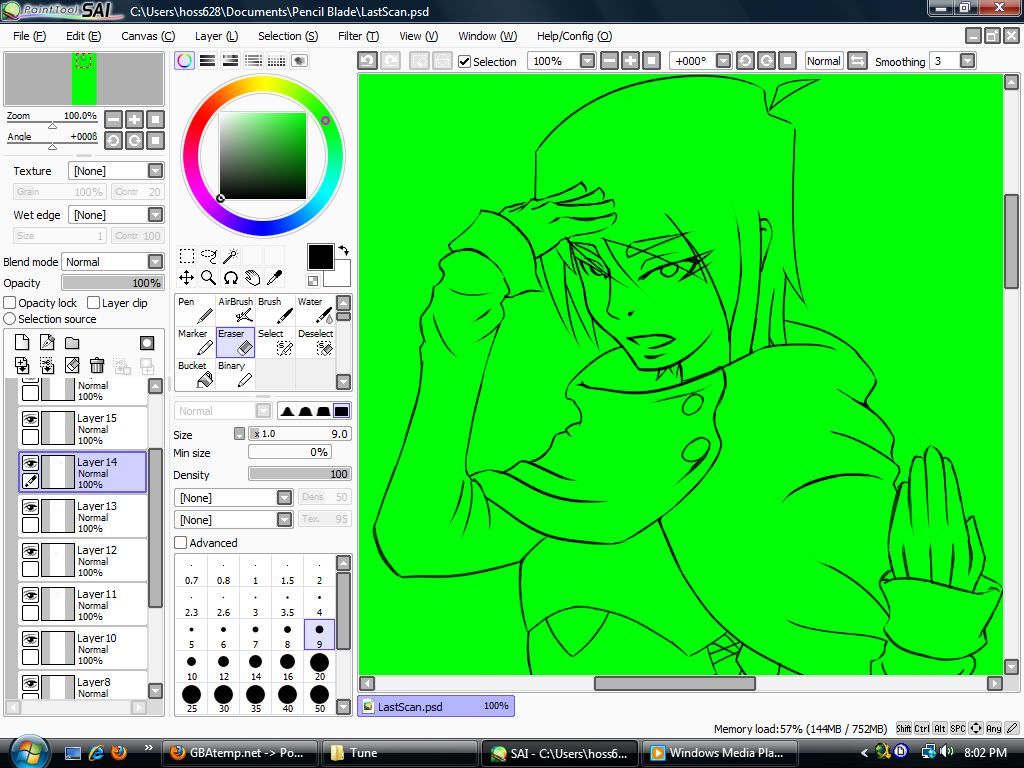
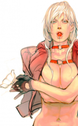
Recently I started to line a sketch. usually I use a 3 pixel brush, but yesterday I decided to go with a 5 pixel brush so i can erase the lines to preferred thicknesses.
What I want to ask is which looks better in your eyes.
Here are samples of two pics. The one on the top was done yesterday. While the one on the bottom was done three months ago.
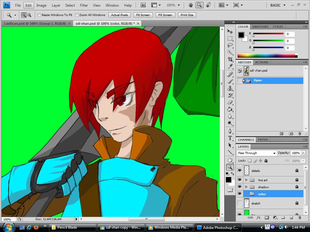
Here is the bottom image colored.
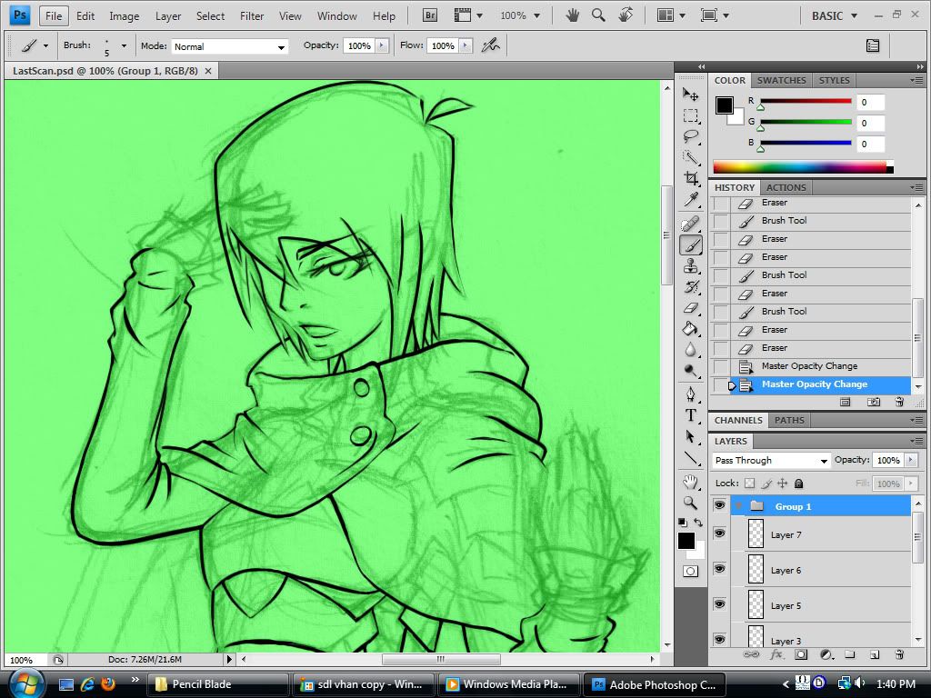
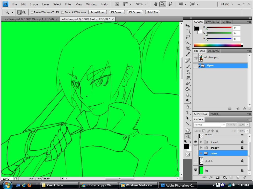
Here are the original sketches.
What I want to ask is which looks better in your eyes.
Here are samples of two pics. The one on the top was done yesterday. While the one on the bottom was done three months ago.
Spoiler:
Here is the bottom image colored.
Spoiler:
Here are the original sketches.
Spoiler:


0

awesome stuff XD
ummm I like the line done in the first one but seems a little to think or its just that I like the one below it XD ummm...the 2nd one could use the lines from above to make it more clean and stand out so try and incorporate the lines you used from 1st one to drawings you do with 2nd one XD
you should try SAI its lots of fun with everything ^^
0

In my opinion, I like the variation of the lines in the first but I much prefer thiner lines like in the second.
You should really try SAI out, it has the best pressure sensitivity for lineart, so while you can have a 10px brush you can still achieve a 3px line with less pressure on the tablet.
You should really try SAI out, it has the best pressure sensitivity for lineart, so while you can have a 10px brush you can still achieve a 3px line with less pressure on the tablet.
0
I think it depends on what feeling you want to suggest in your work. The thicker line is more aggressive and heavy, it's an attention grabber, whereas the softer line has little "presence"on the page and in the context of the picture as a whole. I think both serve different purposes, ya know...
0
Jmac
"I'm a boob man"
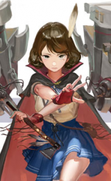
I like the one with the sword. Because it me it's more proportioned. But then again I haven't had life drawing in a year, so I could be wrong...
0
Thank you all for your input so far.
I must say SAI in an impressive looking program. I just got a trial so I'm gonna give it a test drive.
I must say SAI in an impressive looking program. I just got a trial so I'm gonna give it a test drive.