IvIajoi2n Posts
Avatar themed caption i made to represent how i feel right now. If you haven't seen the series this will be confusing.

It didn't hit me as hard, because i'm already way to familiar with Key's story practice of making you feel good, then tearing your heart out. After Little Busters i don't think i can sit through another Key related IP. Because i know down the road that innocent girl who calls you onii-san actually has a terminal illness that is uncurable. Or is actually just some kind of figment of your imagination, and is an imprint of someone's memory.
Kaimax wrote...
Shinji Ex wrote...
Girls That are anthropomorphic Guns who are not providing nearly enough Fan Service.fixed
Once again.
Ya this one looks a lot better, has more tone and value on it. It might help with contrast if you fill in some of the clothes or the hair. Right now the range of value is pretty small, a lot of light grays.
Too-much-work wrote...
IvIajoi2n wrote...
Draw from your Elbow and Shoulder, lock your hand and don't allow it to play a role in your drawing. Lines drawn from the elbow and shoulder come out smoother.So basically, try and ease off of my wrists more?
Also, using a wacom.
Ya basically, it's hard to get used to but it'll pay off later. You can start with basic shapes and lines to get the hang of it.
Spoiler:

Big improvement, but stop thinking in lines and start thinking in values. If there's a place you can eliminate a line then it's worth doing it (sometimes). For example you drew a line around the nipples. You didn't need to do that, there's already a boundary being created. The nipple is a different color from the skin so when those two colors meet they'll create a natural boundary so there isn't a need for a line. Out of curiosity what program are you using to color? also are you using a tablet or just a mouse??
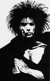
I made this really quick sketch to represent what i'm talking about, since i couldn't find anything in my books that was less then 5 pages. Lines are there to create an outline for the drawing, once you start filling in values you can start phasing out lines. When two values meet then the boundary is already implied, so you don't need a line anymore. Line also plays a role in texturing but that's something you can worry about later.

Jojingo wrote...
There was a lot there that I didn't know. :) But I do only draw for fun. ^-^Ah, well that's fine too. If it's for fun then doing what's the most interesting is obviously what's important.
Maeve wrote...
IvIajoi2n wrote...
Koko7 wrote...
OMG IM PREGNANT. D:Flush it.
Get the Car, we have a city to save.
**Cocks Shotgun**
Screen cap studies of Anime is generally not a good practice technique, unless you're doing it for fun. Or trying to learn and immitate the style of the drawing. If that's the case it's better to work from an Artbook for the show. Anime is on a time schedule, so a lot of the detail an artist would normally put into his piece gets lost. Things like core shadows and reflected light normally aren't included.
For an anime you may also do a storyboard reconstruction study. Take a 30 - 45 second chunk of the anime and arrange it into a set of still shots. It helps when you're trying to learn how to set up a storyboard. That's something you can put off for later though.
Below is a picture from a Bleach Artbook, you can see there's a lot more tone being put down here.
Spoiler:

More crappy book and life studies from this week, the gestures won't go up because they look pretty atrocious.
Spoiler:


high_time wrote...
crimson875 wrote...
a heaven for artist like usDon't you mean
http://conceptart.org/
OT : I like how you drawn the chara with the traditional art stylings, I'm looking forward to see more in the future!
^This pretty much^ i love Fakku and all but CA.org is really helpful if you want a devoted community of critiques. CGhubs is also good, but i found it's more for people looking for professional work.
Tempertester wrote...
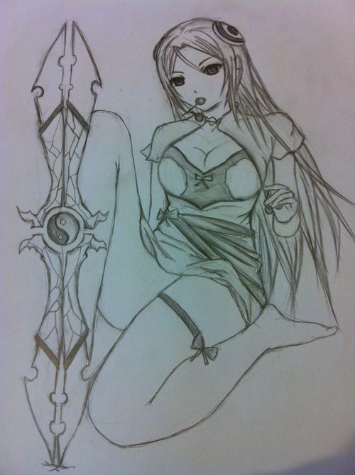
new one, havn't decided to use which boots though
I really love your line work, very clean, smooth and confident line work here. I think It'd really help these ladies some more values were added. A cast shadow will ground this girl specifically. Right now she kind of looks like she's floating in nothingness. A cast shadow establishes the ground beneath her, it adds more weight to the piece over all.
Half tones and core shadows add form and depth, otherwise it'll come out very flat. Regardless of how good this line work is :)
The over-drawing you're doing digitally looks kind of jagged. Are you using a wacom or a mouse?
Also the original line-art beneath shows a lot of chicken scratch. It's usual a result of a very firm and forced grip on your pencil. There's an excercise called oval drawing a lot of people do as warm ups before they start a piece. Take a pencil and just draw various oval shapes on your paper. Draw from your Elbow and Shoulder, lock your hand and don't allow it to play a role in your drawing. Lines drawn from the elbow and shoulder come out smoother. Matt Kohr will do like an hour of these before he starts his actual work to loosen his arms up.
You want to train yourself to use the full range of motion your body is capable of. It's also a confidence thing, we make shorter lines because they feel easier to control. So we kind of scratch lines on one by one, hence the term chicken scratch. Another reason is because most of us learn how to write before we learn how to draw. It's hammered into us to hold a pencil or pen like a writing tool. So we usually keep our hand near the nib. Move your hand further away from the pencil nib.
Some pencil holds actually involve you removing any element of control over the pencil. Examples of this are the Violin Bow Hold and Knife Hold. You should be fine with the standard Pen hold though, just don't grip it to close to the nib or it becomes a writing tool.
Spoiler:

It's because of how little tone is on the drawing. So far the darkest places on most of these pieces are the lines. Start increasing your value range slowly to increase your confidence in value. Work with darker darks and lighter lights. The more variation in value you can put down on a drawing, the better it's going to look.
Also Real Anatomy and Anime anatomy are not very different from one another. They seem very stylized, because the original artist knew what parts of the body he could alter without making it look odd. Even Ken Amatsu keeps his figures fairly close to the 8 Head figure. The middle of the breasts is generally about 2 heads down. The navel about 3 head down, the groin about 4 heads down. The legs will be about 4 heads in length, with the knee roughly being at the 6 head mark.
The main difference between Anime and Real anatomy is the amount of detail being put on to the muscles. Otherwise the general structure is close if not identical. Obviously with some exceptions like Panty & Stocking.
There's two types of Stylization that can occur, Informed Styles and Forced Styles. The latter usually occurs when someone is uncertain of how something is structured, you're brain tries the best it can to create what it thinks might be correct. Informed Styles are when the artist makes a conscious decision to change an element of his design. Most artists start drawing fairly realistically at least with studies. They know how the foundation function, then they change things based on what their design goals are.
Lastly, i will say the most recent image you did, shows some very strong anatomical improvements from when your older pieces. it can be pushed forward but the improvement is still very noticable.
Below i provided a rough image from Love Hina one of Ken Akamatsu's anime. I outlined the general real proportion it uses. Also just a few locations of muscle groups & Bones that were noticable on the surface.

Juggle wrote...
Update: Picked up my pen again .... Doodle time ....Spoiler:

These doodles are lively and have some good personality in the subject matters. But i somewhat agree with the thick line comment. Line art is fine, but thick lines usually represent a lack of confidence in your strokes. When an artist is uncertain of an action, whether subconscious or consciously, it shows in the product. To counter a shakey unconfident stroke usually we naturally press down harder on the drawing tool. I get something similar if i take a break for to long and my coordination goes down.
Also the reason Manga looks the way it looks is because of time constraints. There's usually a deadline for most Manga. So it's more effective to just lay down lines and then put down tone. The lines are left intact because in order to phase out the lines the Artist would have to add more tone and value to the art. A black line does two things, it represents the end of the surface area. If a character or object is completely surrounded by a black line, it'll appear flat. If you look at most Art books released by Mangaka, they chose to do full renders as opposed to the usual ink toning they do for manga.
This doesn't mean a black line doesn't have a place in art, but it shouldn't completely encase the subject. Darken lines in the places you want to create contrast in, this will naturally draw attention to that area. A good place to put them is usually around the face, that's where you want people to look. Thick black lines are usually to jarring for the eyes. I usually hold my pencil around the midsection of the pencil itself. The closer you get to the nib the easier it'll be for you to push down harder.
NOTE: I'm mostly referring to finished pieces. If you're just brainstorming, doodling to loosen up, doing gestures or doing studies then it's all good.
Lastly i'll put this piece of art up by Noizi Ito, it has fairly good line balance in it. I tried to pick out an artist with a somewhat similar style to yours.