Jacob Posts

I attended Comiket 83 yesterday and picked up a bunch of new doujinshi for the store. I'll slowly be adding them to the store, but supplies are limited and I won't be able to ship them out till I get home. Head over to the store to check them out, and if you have any requests send me an email!

I met up with FreeOtakuGhost in Japan and we get some beers!

The next day he was my guide around Comiket which was really awesome, we caught the first trai and stared lining up at 5am. I had to leave early though cause my girlfriend got sick (too many otaku).
Here's a picture of the line:

The next day he was my guide around Comiket which was really awesome, we caught the first trai and stared lining up at 5am. I had to leave early though cause my girlfriend got sick (too many otaku).
Here's a picture of the line:
This is a pretty awesome topic, once I start watching through the old Gundam series I'll be referencing this. Nice job!

Very cool concept, you did a good job explaining it! I think each of the EVA hands should have been the color of the corresponding unit, it would have added more to the design. I really like that the "core" represents the Earth and also looks like an actual angel core.
Ero_Senin wrote...
Here is my entry for this contest.I will do couple more if I don`t be lazy and drunk this two days. https://www.fakku.net/image-404/images/1290974-P0TVOTK.jpg
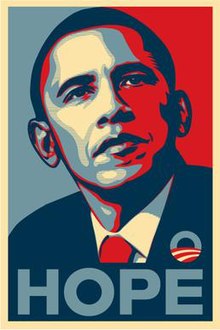
Very cool design, though I don't think Commander Ikari glaring at me from behind his desks screams "hope"... Next time if you do a similiar design keep it more in tune with the original. In this case I would have made the text English and overall made the design more vertical. But all in all Commander Ikari looks badass.
I'm impressed with how many designs you came up with, and they are all pretty solid designs. "I CAN USE YOU" and "KEEP CALM AND MAKE AT FIELDS" stand out to me as the best designs for shirts, and the SEELE vector looks clean and awesome. I'm definitely looking forward to your entries in future contests. I'd suggest using more shirt colors than just black, it can really help improve a design to see it on different background.
Oh and you should post those pixelated EVA pilots as an image!
Oh and you should post those pixelated EVA pilots as an image!
I really like how you combined the FAKKU and NERV logos, looks pretty awesome. And I agree with THE simple. that would be an awesome tagless tag for any Evangelion shirts we print. That said, I think in general entries in these contests should not include elements from FAKKU (unless that's the theme of the contest).
I really like typographic designs, so I am all for shirts like this. The eyepatch especially looks badass. I'm really looking forward to seeing how your typography skills mature in the future, I see a lot of potential :)
alconqueso wrote...
[size=12]A piece of fan art I've had lingering around that I did a year ago. Now I can put it to use! A minimalist design, focusing on everything that isn't white so that your eyes fill in the shapes. (At least, those familiar with Evangelion)[/h][/font]Cool idea, I really like the mass production eva units. I think the issue here is the design gets lost on the white shirt (which I realize was intentional). But having an outline around the unite would probably look better.
TehWalshie wrote...

I feel that we need some more Angel love, so I bring a simplistic reference to them. I feel it's missing something so I may make an update to it at some point when I have more time.
I agree we need more angel love, and having a shirt design that incorporates the core of an angel into the chest could be pretty awesome. The issue with your design is that it isn't noticeably evangelion, and the text looks a bit off. Looking forward to seeing your designs in the next contest.
ScribeZazu wrote...
This is a simple design i conjured up while studying EVA unit 01. I could make different versions of this design, like the other EVA units etc etc. i guess it'll be like a scene from the terminator where you see the inner workings of whoever is wearing the shirt lol.
this is a first draft, the more polished version should be done in a few hours, Im still debating myself on whether or not i should stick to monochromatic color scheme or just the color scheme in the anime.
with peace and love,
-Scribe
I'm not entirely sure what the design is actually showing, but your idea of showing the "inner workings" of an eva visible through tears in the shirt is pretty cool.
Dr-Sentinel wrote...
This is just a rough draft, but I hope you like it. I will clean it up once I get more time to work on it.The sketch actually looks pretty cool, I would have liked to see a finished design!
