0
Rise-chan wrote...
BlackShogunFox wrote...
Here is the new layout once again I think it came out horrible but your guidelines were the saving grace of this draft...Spoiler:

Can't say it's good, but at least you tried.
I know I find myself rushing alot more recently...
What should I fix? I mean really give me any feedback...
0
Cinia Pacifica
Ojou-sama Writer
BlackShogunFox wrote...
Rise-chan wrote...
BlackShogunFox wrote...
Here is the new layout once again I think it came out horrible but your guidelines were the saving grace of this draft...Spoiler:
Can't say it's good, but at least you tried.
I know I find myself rushing alot more recently...
It seemed more... cartoon-ish. If you're gonna call it a manga, you might wanna work towards Japanese art style as much as possible, I suppose.
0
Rise-chan wrote...
BlackShogunFox wrote...
Rise-chan wrote...
BlackShogunFox wrote...
Here is the new layout once again I think it came out horrible but your guidelines were the saving grace of this draft...Spoiler:
Can't say it's good, but at least you tried.
I know I find myself rushing alot more recently...
It seemed more... cartoon-ish. If you're gonna call it a manga, you might wanna work towards Japanese art style as much as possible, I suppose.
I know you are not saying it should be black and white. Could you be saying that both the color and overall drawings should be revamped?
0
Cinia Pacifica
Ojou-sama Writer
BlackShogunFox wrote...
Rise-chan wrote...
BlackShogunFox wrote...
Rise-chan wrote...
BlackShogunFox wrote...
Here is the new layout once again I think it came out horrible but your guidelines were the saving grace of this draft...Spoiler:
Can't say it's good, but at least you tried.
I know I find myself rushing alot more recently...
It seemed more... cartoon-ish. If you're gonna call it a manga, you might wanna work towards Japanese art style as much as possible, I suppose.
I know you are not saying it should be black and white. Could you be saying that both the color and overall drawings should be revamped?
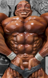
I think so... the dick looks too pink. I know that it's supposed to be pink (lol), but it seems a little too bright, it could just be me, of course. Just my opinions here really.
The shapes are rather far below perfect which... you probably know about, and that's what really deviates this from a normal manga art.
0
Rise-chan wrote...
BlackShogunFox wrote...
Rise-chan wrote...
BlackShogunFox wrote...
Rise-chan wrote...
BlackShogunFox wrote...
Here is the new layout once again I think it came out horrible but your guidelines were the saving grace of this draft...Spoiler:
Can't say it's good, but at least you tried.
I know I find myself rushing alot more recently...
It seemed more... cartoon-ish. If you're gonna call it a manga, you might wanna work towards Japanese art style as much as possible, I suppose.
I know you are not saying it should be black and white. Could you be saying that both the color and overall drawings should be revamped?
I think so... the dick looks too pink. I know that it's supposed to be pink (lol), but it seems a little too bright, it could just be me, of course. Just my opinions here really.
The shapes are rather far below perfect which... you probably know about, and that's what really deviates this from a normal manga art.
Understood, you are right on all points however it is concept layout and we(or I) plan to make it look WAY better than this in the final layout. It feels like with all the time we are taking to finish this we could have done an animation on "Tiny Boobs Giant Tits History" ya know...lol(*Which I would like to do very much! Who's with me on this man?)
0
Cinia Pacifica
Ojou-sama Writer
BlackShogunFox wrote...
Rise-chan wrote...
BlackShogunFox wrote...
Rise-chan wrote...
BlackShogunFox wrote...
Rise-chan wrote...
BlackShogunFox wrote...
Here is the new layout once again I think it came out horrible but your guidelines were the saving grace of this draft...Spoiler:
Can't say it's good, but at least you tried.
I know I find myself rushing alot more recently...
It seemed more... cartoon-ish. If you're gonna call it a manga, you might wanna work towards Japanese art style as much as possible, I suppose.
I know you are not saying it should be black and white. Could you be saying that both the color and overall drawings should be revamped?
I think so... the dick looks too pink. I know that it's supposed to be pink (lol), but it seems a little too bright, it could just be me, of course. Just my opinions here really.
The shapes are rather far below perfect which... you probably know about, and that's what really deviates this from a normal manga art.
Understood, you are right on all points however it is concept layout and we(or I) plan to make it look WAY better than this in the final layout. It feels like with all the time we are taking to finish this we could have done an animation on "Tiny Boobs Giant Tits History" ya know...lol(*Which I would like to do very much who's with me on this man?)
Lol. I guess it takes lots of time when you have to constantly deal with a busy life. Unfortunate, I can't draw, if I could, I'd join in such an activity. My life is mostly on the internet... lol.
0
Thanks for providing the feedback, Rise-chan~
Like SAM, I've also gotten sidetracked by a side-project. I'm making some animated bumpers for an SC2 caster. Gotta finish that project before DreamHack, a European LAN event, so I'll have that finished by the 19th.
Like SAM, I've also gotten sidetracked by a side-project. I'm making some animated bumpers for an SC2 caster. Gotta finish that project before DreamHack, a European LAN event, so I'll have that finished by the 19th.
0
MrCantStopTheRobot wrote...
Thanks for providing the feedback, Rise-chan~Like SAM, I've also gotten sidetracked by a side-project. I'm making some animated bumpers for an SC2 caster. Gotta finish that project before DreamHack, a European LAN event, so I'll have that finished by the 19th.
Good luck on your project.
0
i lost the usb cord for my scaner and using another usb cord wasnt working. i have to clean my room to find. it will take a bit before i get the images up.
0
SeriousSAM wrote...
i lost the usb cord for my scaner and using another usb cord wasnt working. i have to clean my room to find. it will take a bit before i get the images up.Yeah! Its a party. Its a party. Its a party...
0
what?
well i found my usb cord and my room is clean and reorganized
the script layout
Spoiler:


page layout, not gonna lie it feels terrible to me
Spoiler:


either way, i feel we should skip the anal scene and go for an ending. this is taking a lot longer than necessary to complete.
also we should discuss way to re-layout the the panels and to rework some of the dialog.
for the panels, i'm just throwing out what i think feels right but it looks pretty boring. as for the the dialog i dont know, it feels like it should be reworked a little to have a better story
0
SeriousSAM wrote...
what?
well i found my usb cord and my room is clean and reorganized
the script layout
Spoiler:
page layout, not gonna lie it feels terrible to me
Spoiler:
either way, i feel we should skip the anal scene and go for an ending. this is taking a lot longer than necessary to complete.
also we should discuss way to re-layout the the panels and to rework some of the dialog.
for the panels, i'm just throwing out what i think feels right but it looks pretty boring. as for the the dialog i dont know, it feels like it should be reworked a little to have a better story
Freakin finally bout time ya finished ya layouts...
In all honesty we have to many chefs and too many hands in the pot however we are doin just fine. We must have an iron resolve and finish this project! We must stop this deadly alliance...
0

I'm amazed that this thread hasn't died out yet~ it looks interesting though, anyway I could pitch in? my art is sub-par though (check my sig)...maybe in writing?
Page layout has always been horrible, who wanted to make a detailed one anyway? lol
Page layout has always been horrible, who wanted to make a detailed one anyway? lol
0
Ereine wrote...
I'm amazed that this thread hasn't died out yet~ it looks interesting though, anyway I could pitch in? my art is sub-par though (check my sig)...maybe in writing?Page layout has always been horrible, who wanted to make a detailed one anyway? lol
as of right now there isnt much that needs to be helped on with the way things are going.
the one thing that hasnt been talked about yet is the main artist after freaky left the team.
also discussion on a better layout

1
Kinda looking forward to this project XD, I always want to see how newly formed groups make comics/mangas and read the finalized piece after
Goodluck to you guys
Goodluck to you guys
0
Juggle wrote...
Kinda looking forward to this project XD, I always want to see how newly formed groups make comics/mangas and read the finalized piece afterGoodluck to you guys
Thank you Juggle. I will have somethin up anytime by now for the next layout.
Yeah! Woo...
0
Juggle wrote...
Kinda looking forward to this project XD, I always want to see how newly formed groups make comics/mangas and read the finalized piece afterGoodluck to you guys
Thanks Juggle.
I'm back yo.
Had to go beastmode to finish these animations:
http://trickyrobot.com/t_refined_colored.swf
http://trickyrobot.com/z_refined_colored.swf
http://trickyrobot.com/p_refined_colored.swf
Vis-Ã -vis this project, though, here's a revamped page 1:
http://trickyrobot.com/robot_page1.jpg
This means there are now lines in my style for pages 1, 4, 5 and 6. Next up, pages 2 and 3.
I'm pretty much the main artist at this point, at least for lines. I've produced two reference sheets and now 4 pages of lines. SAM, you should contribute a few pages of lines, as well, not just layouts. You're good.
Did anyone post a layout for page 3? I checked two weeks ago, but didn't find it.
0
It looks really nice and proffesional. The only thing being that I don't find that the background looks very manga-ish. Really cool animations btw!
Vis-Ã -vis this project, though, here's a revamped page 1:
http://trickyrobot.com/robot_page1.jpg
This means there are now lines in my style for pages 1, 4, 5 and 6. Next up, pages 2 and 3.
I'm pretty much the main artist at this point, at least for lines. I've produced two reference sheets and now 4 pages of lines. SAM, you should contribute a few pages of lines, as well, not just layouts. You're good.
Did anyone post a layout for page 3? I checked two weeks ago, but didn't find it.
MrCantStopTheRobot wrote...
Vis-Ã -vis this project, though, here's a revamped page 1:
http://trickyrobot.com/robot_page1.jpg
This means there are now lines in my style for pages 1, 4, 5 and 6. Next up, pages 2 and 3.
I'm pretty much the main artist at this point, at least for lines. I've produced two reference sheets and now 4 pages of lines. SAM, you should contribute a few pages of lines, as well, not just layouts. You're good.
Did anyone post a layout for page 3? I checked two weeks ago, but didn't find it.